Choosing the right colour space can feel like a bit of a headache, especially when you just want to get on with your work and make things look great. It is one of those technical topics that often gets over-complicated with jargon, but it really comes down to how much colour your file can hold and where that file is eventually going to live.
Big picture: colour spaces
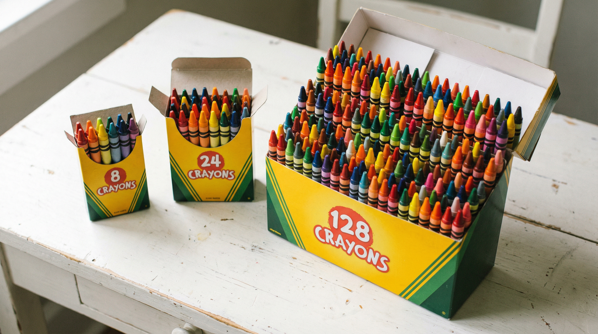
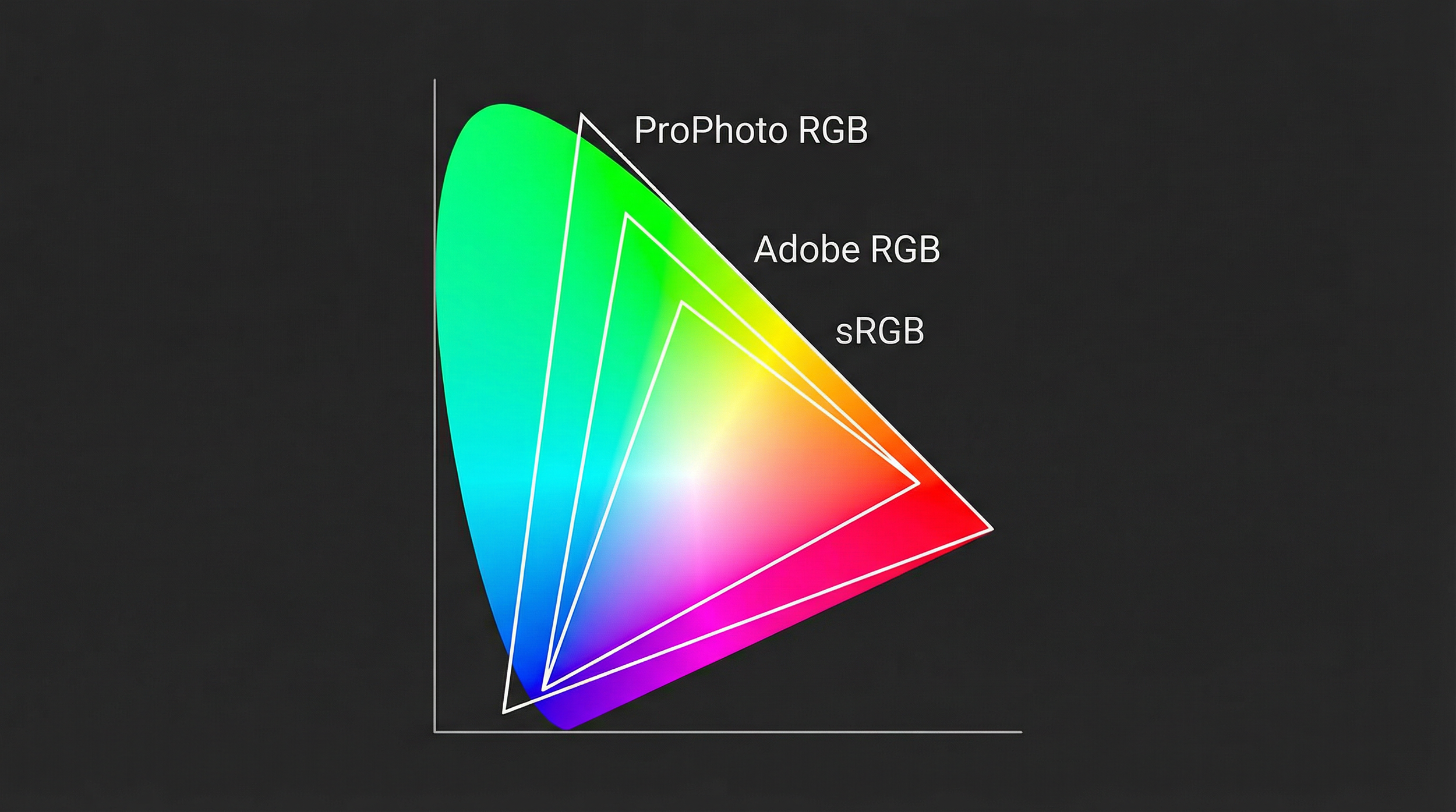
Think of a colour space like a box of crayons. Some boxes have the basic 8 colours, while others have 128, and each digital colour space is just a different "box" with its own range of possible colours (gamut) inside. For common RGB spaces like sRGB, Adobe RGB, Display P3, and Rec. 709, that gamut is usually shown as a triangle sitting inside the horseshoe-shaped map of all colours the human eye can see.
sRGB: the universal baseline
Created in the mid-1990s by HP and Microsoft, sRGB was designed as a standard colour space that typical monitors, printers, operating systems, and web browsers could all assume by default. If you are posting a photo to Instagram, a blog, or sending it to a standard consumer lab for prints, sRGB is the safest choice because it is the "lowest common denominator" most devices expect.
Use case: Web, social media, and general consumer printing where you cannot control colour management. sRGB gives predictable, consistent colour on the widest range of devices.
Limitation: sRGB is a relatively small "box of crayons," especially in saturated greens and cyans, so it cannot represent all the rich colours modern cameras can capture.
Adobe RGB (1998): print-oriented wider gamut
Adobe RGB (1998) was developed by Adobe to cover a wider gamut than sRGB, with more reach into greens and some cyans, and to better match the range achievable by high-quality CMYK printing processes. On a gamut diagram you can see Adobe RGB extending further towards the green corner than sRGB, which is particularly useful for subjects like foliage, seascapes, and some print workflows.
Use case: Professional printing and high-end photography workflows where files will go to colour-managed printers or presses that can exploit the wider gamut.
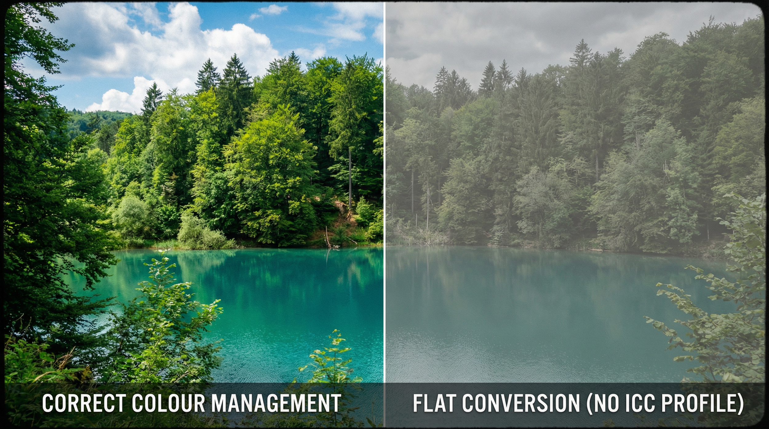
Limitation: If you upload an Adobe RGB image to a non-colour-managed website, the browser often treats it as sRGB, which makes it look dull and washed out because the extra gamut is compressed incorrectly.
ProPhoto RGB: extremely wide editing space
ProPhoto RGB (also known as ROMM RGB) is a very large-gamut colour space developed by Kodak, designed to include almost all real-world surface colours and even some mathematically defined "imaginary" colours that lie just outside the human-visible locus. Because its gamut is so wide, it comfortably contains colours that fall outside both sRGB and Adobe RGB, which can occur in highly saturated parts of modern digital captures.
When you shoot RAW, the camera records sensor data that is not yet in any RGB colour space; the RAW developer chooses a working space for editing. Applications like Lightroom use an internal working space (often described as MelissaRGB or a linear ProPhoto variant) that shares ProPhoto's primaries, giving you a ProPhoto-sized gamut while you make adjustments.
Use case: As a working or internal space for developing high-quality RAW files, where a very wide gamut helps avoid clipping intense colours during heavy editing.
Limitation: ProPhoto is so large that using it in 8-bit can cause banding in gradients, so it should be paired with 16-bit editing to maintain smooth transitions. It is also a poor choice as a delivery space for general viewing or the web, because most devices and browsers either do not handle it correctly or cannot display its gamut, leading to flat or strange colour; final exports for sharing are usually converted to sRGB or at most Adobe RGB/P3.
Using a ProPhoto-based space during editing gives you room to "hold" all the colour the RAW data can produce, but the RAW itself is not stored "in" ProPhoto.
What about Display P3?
If you use an iPhone, a Mac, or a recent high-end monitor, you have probably seen Display P3 mentioned. It is a modern wide-gamut colour space, built from the cinema P3 primaries but adapted to the D65 white point and an sRGB-style tone curve used on typical computer displays.
To understand it, it helps to start with DCI-P3. That is the "box of crayons" designed for digital cinema projectors in movie theatres, with a gamma around 2.6 and a slightly green-tinted white balanced for xenon-lamp projection. Its gamut reaches significantly further than sRGB in reds and greens, which is one reason properly graded movies can look so saturated and "punchy" on the big screen.
Display P3 is essentially a more desktop-friendly variant of that cinema colour. It uses the same P3 primaries, but adopts the D65 white point shared by sRGB and Adobe RGB, and an sRGB-like transfer curve (roughly gamma 2.2), making it better suited to normal monitor and device viewing.
How it compares to Adobe RGB
Adobe RGB and Display P3 are both wide-gamut spaces of similar overall volume, but with different shapes.
Adobe RGB reaches further into deep greens and blues, which is why it has long been favoured for print workflows where those hues matter and where printers and papers can take advantage of that gamut
Display P3 pushes more into richly saturated oranges and reds, while not extending quite as far as Adobe RGB in some green-blue regions
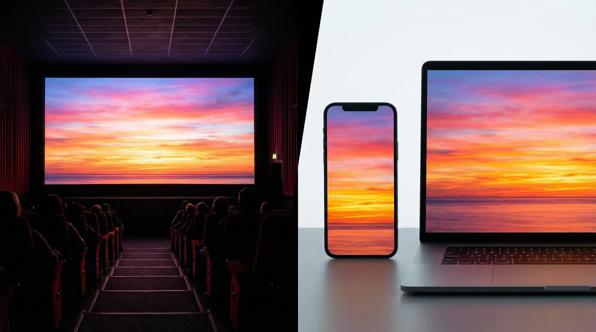
Use case: If you are creating content primarily for modern wide-gamut smartphones, tablets, and laptops that support Display P3 and are properly colour-managed, working in Display P3 lets you use colours that go beyond sRGB, so images can look more lifelike and vibrant on those devices. On older or strictly sRGB-only screens, though, those extra colours are either mapped back into sRGB or clipped, so the advantage largely disappears.
Which one should you use?
A simple, robust way to stay sane is to separate "editing space" from "delivery space." During RAW editing, using a very wide-gamut space like ProPhoto (or Lightroom's ProPhoto-based internal space) in 16-bit keeps as much colour information as possible while you make adjustments. When you are finished and ready to share or upload, you convert a copy of that master to sRGB (or to Adobe RGB/P3 if you are targeting a fully colour-managed, wide-gamut environment), so it looks correct on most people's devices.
This approach gives you a master file that preserves the widest feasible gamut for future prints or re-edits, plus final exports tailored to where the image will actually live (web, print, or video) without sacrificing consistency for your viewers.
Creating a print master in Adobe RGB
When it's time to take an image off the screen and put it onto paper, I often convert my files to Adobe RGB as a dedicated "print master." It might seem like an extra step, but there is a very practical reason for it: it gives the print system more of the colours that high-quality printers can actually reproduce, especially beyond plain sRGB.
Matching what the printer can really do
Many modern high-quality inkjet and lab printers can reproduce certain colours (particularly some vibrant cyans, deep blues, and rich greens) that extend outside the sRGB gamut. If a scene or RAW file contains those more saturated hues, converting everything into sRGB first can compress or clip them before the printer even gets a chance to do its job, so the print may not show all the nuance that was originally captured.
By keeping the editing in a wide space (like ProPhoto RGB or Lightroom's internal MelissaRGB space, which uses ProPhoto-based primaries) and then creating a print file in Adobe RGB, the file can still describe many of those "extra" printable colours that sRGB would squeeze in.
In real-world terms, this often shows up as:
More believable foliage
Subtler turquoise water
More faithful fabric tones when the printer and paper are capable of that gamut
Bridging the gap to CMYK
The ink in a printer behaves very differently from the light on your screen: monitors work in RGB (Red, Green, Blue), while printers work in CMYK (Cyan, Magenta, Yellow, Black) or multi-ink variants. A printer's CMYK gamut has a lumpy, irregular shape. There are regions, especially in certain blue-green areas, where it stretches outside sRGB, and other regions (like very bright, saturated oranges and yellows) where it is actually smaller than sRGB.
Adobe RGB was designed to better encompass typical CMYK print gamuts, so it overlaps much more closely with the colours high-quality printing systems can produce. It does not literally "cover every possible CMYK colour," but it does include most of the printable colours that sit outside sRGB, which means you are less likely to be "leaving colour on the table" when you hand a file to a good, colour-managed print workflow.
How this fits into a print workflow
Edit in a very wide-gamut space (e.g., ProPhoto RGB or Lightroom's MelissaRGB internal space) to keep as much colour information from the RAW as possible while you do the heavy lifting
Create a print master in Adobe RGB once the edit is finished, so the file aligns better with what many high-end printers and papers can show than sRGB does
Match the lab's requirements, since some pro and fine-art labs prefer Adobe RGB (or accept ProPhoto), while many consumer or high-street labs still expect sRGB only

The bottom line
Ultimately, it is all about making sure the final physical print gets as close to your vision as the printer and paper combination allows. Using a very restricted colour space for a high-end print setup is a bit like buying a sports car and never taking it out of second gear: it will still move, but you will never see what it is truly capable of.