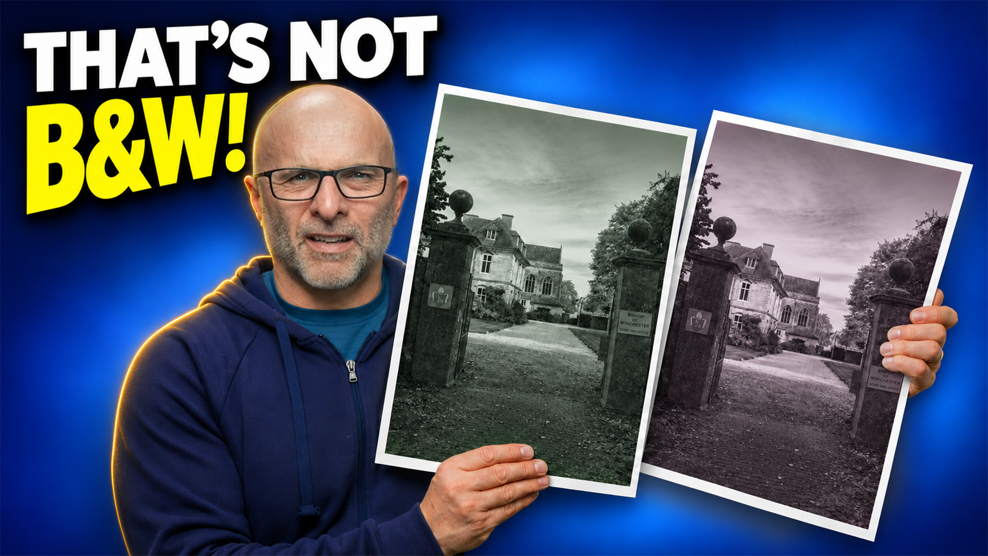
Apart from why prints come out too dark, the printing question I'm asked the most is why black and white prints come out with a green tint, or sometimes a magenta one. It's a really common problem, so if it's happened to you, don't blame yourself.
There's a setting on both Canon and Epson printers that's there for exactly this, and the video above shows you where to find it, along with the times it won't help. Here's an overview of what's in it.
Why the tint happens
To print a grey, the printer mixes colour inks, and if that mix is slightly out, the grey leans towards green or magenta. You wouldn't see that in a colour photograph, but in a black and white print there's no colour around it to hide it.
Zoom right in on a patch of grey and you'll see lots of tiny coloured dots, which your eye blends into grey from a normal viewing distance. When the mix is right the grey looks neutral; when it's out by just a little, the grey picks up a colour.
An ICC profile is built for colour, and Canon UK describe getting a neutral grey this way as tricky. A good profile can get the greys close, but on some papers close still shows a tint.
The light you look at a print under matters as well. It can look neutral in one room and slightly green or magenta in another, which is down to the inks and the light, and it's called metamerism.
What the black and white mode does
I'm using a Canon PRO-1100, but you definitely don't need one of those to fix this. The PRO-200S, PRO-300, PRO-310 and PRO-1000 all have the same black and white print setting. Epson call theirs Advanced Black and White Photo, and you'll find it on printers like the SureColor P700, P900, P600 and P800, as well as older ones like the R3000.
The PRO-1100 has 12 inks, and four of them are for black and white: matte black, photo black, grey and photo grey. When you turn the black and white mode on, the printer converts the picture to greyscale and builds it mostly from those inks.
However, it does still use a little colour ink, and that's completely deliberate. Canon UK say their mode adds light cyan and light magenta to the black and grey inks, while Epson say theirs uses yellow, light cyan and light magenta along with the black inks. That's what keeps the greys neutral, or gives the picture a tone if you want one.
Printing from Photoshop on a Canon
The steps are:
go to File, then Print, and set Colour Handling to Printer Manages Colours
click Print Settings and go to Quality and Media, which on a Mac is inside the printer options
set Media Type to the one your paper maker recommends
tick Black and White Photo Print
go to Colour Matching and choose Canon Colour Matching
go to Colour Options and pick your tone
Printer Manages Colours matters because if an app sends the driver a printing ICC profile, ColorSync gets selected automatically and you can't choose Canon Colour Matching, which is the one we want. If your tone controls are greyed out, this is the first thing to check, because that's what happens when it's set to ColorSync.
In the Colour Options you've got Black and White, which is neutral, plus Cool Tone and Warm Tone, with brightness and contrast in there too. Each tone is a setting on a grid, with Black and White at zero, Cool Tone at minus 30 and Warm Tone at plus 30, and you can set your own if you want something in between.
The easier way on a Canon
If you use Canon's free Professional Print & Layout software, it's a lot easier. It's what I use all the time with my Canon printers, because I find it gets consistently great prints with fewer clicks, and it works with all of the printers I've mentioned.
In the general settings, go to Colour Mode at the bottom and choose Black and White Photo. In the Colour Settings tab you've then got cool, black and white, and warm, along with a tone grid you can click on, and underneath there's strength, highlight, shadow, brightness, contrast and curves if you need them.
Press print and you're good to go.
Printing on an Epson
It works the same way on an Epson:
in Photoshop, set Colour Handling to Printer Manages Colours
in the Mac print dialogue, choose Printer Settings from the pop-up menu
set Media Type to your paper
set Colour to Advanced Black and White Photo
under Colour Toning, choose neutral, cool, warm or sepia
Advanced Colour Settings has tone, brightness, contrast, shadow tonality and highlight tonality, and there's a colour circle for fine toning. It's the same setting if you're on Windows.
If Advanced Black and White Photo isn't in the list, check two things: that Photoshop is set to Printer Manages Colours, and that your media type is one that supports it.
Epson also have a free app called Epson Print Layout, and like the Canon software, it's brilliant. It has the same Advanced Black and White mode with a preview, the same toning choices plus file adjustment, and you can save your own toning, but it may not appear for some media types.
Neutral isn't always what you want
The warm and cool options are there for a reason. Warm can suit a portrait, and cool can suit something like a seascape.
With third party paper, pick the media type the paper maker recommends. I use Fotospeed, and they publish a list for both Canon and Epson. Matte papers do tend to look warmer, and papers with optical brighteners, or OBAs, can look a little bit blue.
If your prints look too dark rather than tinted, that's usually down to your screen being set too bright, which I've covered in Why your Prints are Too Dark (and How to Fix It).
When this won't help
All of this won't fix everything, so run a nozzle check first and have a good look at it before you change any settings. A blocked colour nozzle can put a cast on anything; on one forum, someone had a magenta cast in Epson's Advanced Black and White mode, and a nozzle clean fixed it.
A printer with only four inks has no greys to use, so the black and white mode can't do much. On gloss paper, some four ink printers build black and white from cyan, magenta and yellow, and a driver setting can't change that either.
PRO-1100 owners also have a greyscale paper type that uses only black and grey ink, but you add it in the Media Configuration Tool and you do lose the tone controls.
My advice is to try the black and white mode first, starting with neutral. These modes work extremely well, giving you great black and whites with no unexpected tint, which is exactly what they're there for, but if you prefer to use an ICC profile and it's working for you, then carry on.