Adobe shipped Photoshop 27.7 on the 19thMay 2026, and tucked inside it is one of the more genuinely useful quality-of-life features I've seen in years: the ability to run the Remove tool's generative AI model entirely on your own hardware.
For photographers and retouchers, that means object removal that's faster, works offline, and keeps sensitive client work on your own machine.
What the Remove Tool Actually Does
The Remove tool sits alongside the Healing and Clone tools as Photoshop's go-to way of erasing distractions. You paint over something you don't want, a stray tourist, a power cable, a logo, a blemish, and Photoshop fills the area with believable pixels sampled and synthesised from the surroundings.
In the current version there are effectively three flavours of Remove.
Standard Remove (Generative AI off)
Uses content-aware style algorithms, processed locally. It works well on simple, repeating backgrounds, but it can struggle with complex textures and edges.
Cloud Generative Remove (Generative AI on, Cloud)
Sends your selection to Adobe's servers, where a Firefly-class model generates new pixels to fill the gap. It generally performs better on complex scenes with fine detail, like foliage, hair and signage.
On-device Generative Remove (Generative AI on, Device)
New in Photoshop 27.7. A generative model is downloaded to your computer so the Remove tool can do that heavy lifting locally instead of relying on the cloud.
Functionally, on-device mode aims to give you cloud-quality results with the reliability of local processing.
Why Bother With On-Device Remove?
If Remove already runs in the cloud, why bother with on-device at all? Three reasons.
Speed and responsiveness
In on-device mode, the model runs directly on your GPU rather than making a round trip to Adobe's servers. On powerful machines that means noticeably snappier results, especially on large layered documents or when you're doing lots of small removals across a full shoot.
It works when you're offline
Cloud Remove simply doesn't function without an internet connection. If you're editing on a train, in a remote landscape, in a studio with poor Wi-Fi or at a client office behind a locked-down network, that's a problem. On-device Remove works exactly the same way whether you're online or offline.
Better privacy and data control
Some jobs involve embargoed campaigns, confidential documents or sensitive subjects. In those situations it's often preferable, or contractually required, to keep all processing on your own hardware. On-device Remove keeps the pixels on your machine, which can be an important reassurance for privacy-conscious clients.
The Catch: The Hardware Bar Is High
Running a generative model locally is demanding. Photoshop checks your system automatically, and if it doesn't qualify, the Device option in the Remove tool is simply greyed out.
On Windows, Adobe's current guidance calls for a modern multi-core CPU, a strong GPU, and decent RAM and SSD space:
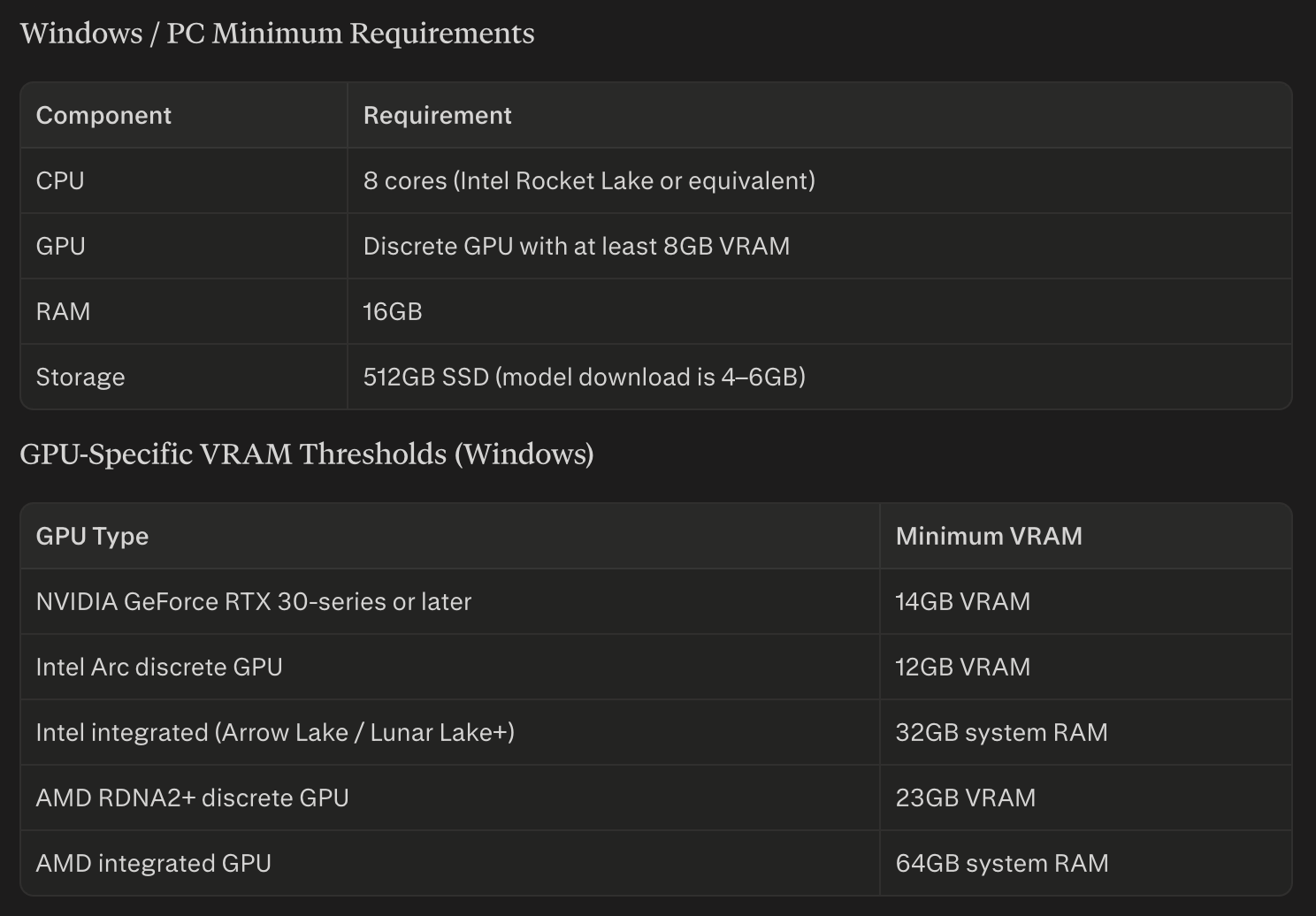
On top of that, Adobe lists higher VRAM thresholds by GPU family. Current documentation and support posts indicate that many mid-range GPUs, some RTX 30-series cards with 12GB of VRAM for example, still don't unlock the Device option for Remove, even though they run other AI features comfortably.
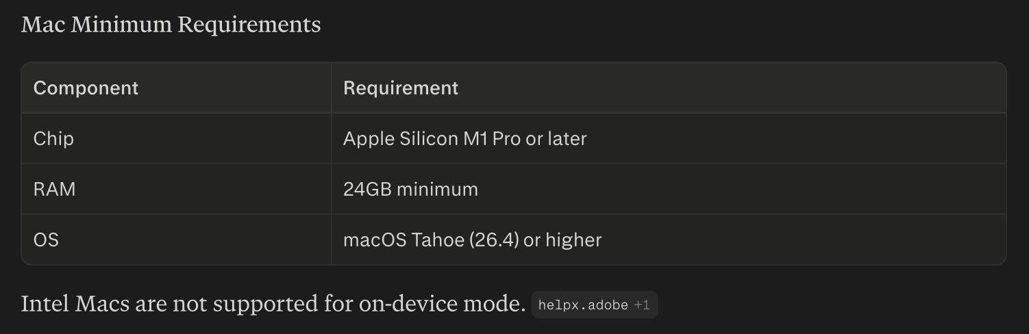
On Mac, on-device Remove is Apple Silicon only. You'll need an M1 Pro or later (M1 Max, M2 Pro, M2 Max and newer are recommended for smooth use), 24GB of RAM or more, and macOS Tahoe (26.4) or newer. Intel Macs aren't supported for the on-device model.
How to Use the On-Device Remove Tool
Once your hardware qualifies and you're running Photoshop 27.7, it's all controlled from within the Remove tool itself.
Select the Remove tool from the toolbar, where it sits with the Spot Healing Brush and Healing Brush.
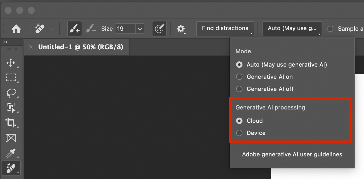
Open the Mode dropdown in the Options bar, where you'll see options such as Auto, GenAI On and GenAI Off.
Choose Device for Generative AI processing. Within that panel, find the Generative AI processing setting and switch it from Cloud to Device.
Download the on-device model. The first time you select Device, Photoshop prompts you to download it, just under 5GB. Confirm it and let it finish.
Paint away distractions. With Device selected, paint over unwanted objects as usual, and Photoshop will use the local model rather than the cloud to generate the replacement pixels.
Switch between Cloud and Device whenever you like, from the same Mode dropdown, if you want to compare quality or fall back to the cloud on less powerful hardware.
If the Device option stays dimmed, it usually means either your hardware doesn't meet the minimum spec or GPU acceleration is switched off in Photoshop's Performance preferences.
Who Will Benefit Most?
On-device Remove is particularly valuable for three groups.
Location, travel and event photographers
You often edit in the field or away from reliable internet. On-device Remove keeps your clean-up workflow working exactly the same wherever you are, hotel room, train, remote shoot or studio with spotty Wi-Fi.
High-volume retouchers
If a big chunk of your day goes on removing logos, stray hairs, dust, cables and background clutter, a faster, offline, privacy-friendly Remove tool makes that daily work smoother and more predictable, especially on time-critical jobs.
Commercial and editorial shooters with sensitive work
When you're dealing with unreleased campaigns or sensitive subjects, being able to say all the retouching was done on-device is a genuine advantage with clients and legal teams.
For casual users on modest hardware, the existing standard and cloud Remove modes will carry on doing the job perfectly well. But if your machine meets Adobe's on-device requirements, the new Remove model in Photoshop 27.7 is one of the most meaningful quality-of-life upgrades in the current release, especially if you live in the Remove tool all day and want its full power without always depending on the cloud.