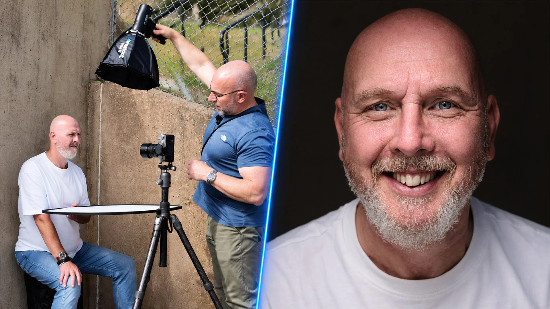
For the past three months I've been touring with Wex Photo Video around the UK on their Summer Roadshow, showing how I take portraits with minimal kit in limited space. I came away with portraits I'm really happy with from every date, but there was one look in particular I was asked about more than any other, so I asked my friend Michael if he'd sit for me and we went outside with one small flash to make it again.
The video above goes through the whole thing, from the shoot, through every step of the edit in Lightroom and Photoshop, to a finished print. Here's an overview of what's in it.
One small flash, outdoors
The idea is simple. Before the flash comes into it at all, I set the camera so that it doesn't see any ambient light; take a picture and you get a black screen. That way the only light in the final shot is the light I put there.
Outdoors in bright sun that takes a bit more doing than it does in a store. I ended up at f/16, which was as far as the lens would go, around ISO 125 and 1/250th of a second, keeping within the flash sync speed rather than reaching for high speed sync or ND filters. I did wonder whether a 100 watt second light could cope with sun that bright, but it wasn't a problem.
The kit was:
the Westcott FJ100 on power 9, so pretty much full power
a 15 inch octa with the grid fitted
a pistol grip handle to hold it steady
the camera on a tripod
a reflector just below chest level
The camera goes on a tripod so Michael has one fixed point to look at, rather than following me around as I move, and I trust the eye autofocus to nail the focus so I don't need to be right behind it.
How the light falls
I raise the light nice and high and get Michael to lean forward a little towards the camera. Because of the grid, the light doesn't go everywhere; it comes down and skips across the front of his face, and it doesn't spill onto the background, which I wanted to keep dark.
What I really like about it is that the light is so directional you get shadow either side of it, so it's almost like having a strip of light running down the front of the face. It's a look I definitely want to work more on.
The one thing that made the biggest difference was the reflector. Flat and horizontal, it did very little for the eyes. Lift the far end so it's angled up towards him and the light bounces back into his face, and suddenly there's plenty of detail in the eyes to work with.
The edit in Lightroom
Only one job happens in Lightroom, and that's the eyes. I use masking to select the iris and pupil, finesse the mask with the feather and edge sliders so it sits just inside the eyes, then lift the exposure slightly and add a little texture, clarity and a touch of dehaze. At 100% the difference with the mask on and off is night and day.
After that the image goes over to Photoshop, because that's where the heavy lifting gets done.
The heavy lifting in Photoshop
My rule of thumb here is to look at the image and fix whatever jumps out first. On this one it was the shine down the middle of Michael's nose, which I took out with the Remove Tool on a new layer, then lowered the opacity to around 50% to bring some of the natural shine back. After that I used the Spot Healing Brush on a blank layer to clean up the more obvious marks in the concrete wall behind him, which was sharper than I'd like because of shooting at f/16.
Most of the work is dodging and burning on a 50% grey layer set to Soft Light, with the Dodge Tool at 10% exposure and the Option key (Alt on Windows) held down to switch to the Burn Tool with the same settings. I brighten the highlights and darken the shadows either side of them, around the eyes, down the nose, the eyebrows and the mouth, and then the folds in his top. It sneaks up on you; you often don't see it until you turn the layer off. Working on a grey layer rather than the image itself also means that if you go too far, you can paint over it with 50% grey and it's gone.
From there it's a handful of smaller things:
a loose lasso round the teeth and a Hue/Saturation adjustment on the yellows, lifting the lightness slightly so they're cleaner without looking like he's had them done
my 2010 technique, two passes of Unsharp Mask on merged layers, amount and radius at 20 then 10 with the threshold at 0, each painted in through a black mask, the first over the middle of the face and the second over the eyes, nose and mouth
a skin texture effect using Reduce Noise at full strength with everything else at zero
a High Pass layer at a radius of 2, set to Hard Light and placed on top, to bring back the sharpness in the eyes, hair and skin detail that the texture effect softens
The 2010 technique is superb on close-up portraits; it makes the face look as if it's coming forward off the screen, and even more so in print.
Camera Raw and a finishing touch
In the Camera Raw filter I used Lens Blur to soften the concrete wall and give the picture a bit of fake depth of field, brushing blur in around the top of the head, the ears and the shoulders so it feels more like f/2.8 or f/4 than f/16. I still wanted to be able to just about see the wall, so it isn't blacked out completely.
A linear gradient with the exposure brought down takes the edge off the bright top he's wearing, which was pulling my eye, and a radial gradient in the middle of the face at +0.2 exposure adds a little light where it matters. I do that last one on pretty much every portrait.
The finishing touch is a warm colour grade from Optics by Boris FX, using the Titanic look in the Portrait colour section, brought down to 50% opacity.
Making the print
I print pretty much every image I'm happy with onto A4, and this one went onto Fotospeed Natural Soft Textured Bright White 315, a fine art matte paper and one I use most of the time, on the Canon PRO-300.
The steps are:
duplicate and flatten the image
resize to 10 inches on the long edge at 300ppi
soft proof with the paper profile, comparing relative and perceptual rendering intents
a slight brightening just for the print
save as a TIFF in Adobe RGB
print from Canon Professional Print & Layout, with Heavyweight Fine Art Paper as the media type, the paper's ICC profile, perceptual rendering intent and black point compensation on
For this picture perceptual was the clear choice. Relative blocked the blacks up quite a lot, whereas perceptual gave it more contrast, which suited it.
Straight out of the printer it was looking really good, and on a matte paper like this it only gets better once the ink has had time to dry and settle. You can just about see detail in the back wall, which is what I was after, and the 2010 technique does exactly what I hoped, bringing the face forward off the page.
Why I always print
Our screens are fantastic, but it's not until you have something physical in your hands that you can really study it and start noticing the things you missed while editing. I truly believe printing can help you get better as a photographer, and certainly better at retouching.
If you'd like to follow along with the video step by step, the raw file I used is free to download from the classroom in my Photography Community on Skool: