adobe

Iron Clothes in Photoshop in 30 Seconds

Almost every conversation I see about AI and photography is about generating things that were never in the frame in the first place, and that's never been the part that interests me. What I actually care about is getting time back. The small distractions that were out of my control on the day, the ones that used to cost me twenty minutes with the healing brush, can now be sorted cleanly in seconds with the texture still intact.

Wrinkled clothing and folded backdrops are the two that come up again and again. So here's how I deal with both.

The orange t shirt

First job on this one was a distracting logo on the shirt, and for that I go straight to the Remove Tool. The setting worth knowing about is Auto, which lets Photoshop work out for itself whether it needs standard content aware fill or whether it needs to reach for generative AI. On a simple cleanup like a small logo it'll usually just handle it locally, which means you're not burning generative processing on something that didn't need it.

With the logo gone, the creases were the bigger problem, and that's a three step job.

Make a loose selection around the whole shirt with the standard Lasso Tool. Nothing precious about it, loose is fine. Then open Generative Fill from the contextual taskbar and pick the Firefly Image 5 model, which in my experience is much better at editing what's already there and preserving fine detail than it is at inventing things you didn't ask for. Then type a clear prompt: "remove the creases from off the orange t shirt".

That's it.

What comes back has the harsh creases gone but the natural drape still there, along with the shadows and the weave of the fabric. It still looks like a t shirt someone was actually wearing, which is the whole point.

That slightly crispy edge, and the Quick Mask fix

The second example was a branded white t shirt, and that's a bit more involved because you want a proper selection rather than a loose lasso.

The Object Selection Tool is quick here, and using Select People and then Upper Clothes gets you there in a couple of clicks. The catch is that it can leave a hard, slightly crispy edge, and you tend to notice it most around the neckline where the shirt meets skin.

In Adobe Camera Raw and in Lightroom there are dedicated Feather and Edge sliders for AI masks, which sort this out instantly. Photoshop doesn't have those in the main workspace at the moment, so you need a workaround, and the one I use is Quick Mask.

Make your selection with the Object Selection Tool, then tap Q to drop into Quick Mask Mode. Go to Filter, then Blur, then Gaussian Blur, and put in something small; I'm usually somewhere between 1 and 1.2 pixels. Tap Q again to come out.

That tiny bit of blur softens the boundary between the mask and the skin so the transition reads as natural rather than cut out.

Being specific is the whole game

This is the bit I'd underline if I were underlining anything.

Generative Fill still needs a clear instruction even when you've made a precise selection. If you type "remove the creases" and nothing else, more often than not you'll get nothing back at all, because the model hasn't been given enough to go on.

Prompt it with "remove the creases from off the white t shirt" instead and it knows exactly what it's looking at and what you want doing. The folds go, the printed typography stays where it was, and the grain of the fabric survives.

It feels fussy the first couple of times. It stops feeling fussy the moment you see the difference.

The same thing works on backdrops

Studio backgrounds are the other one, and the workflow is identical.

Select your subject with Select and then Subject, then invert it with Select and then Inverse so it's the background you're working on rather than the person. Soften that boundary with the same Quick Mask and Gaussian Blur trick, which matters more here than anywhere else because of hair and shoulders.

Then in Generative Fill, be even more specific than you think you need to be. Something like: "remove the creases from off the grey background. do not change the look of the grey background. keep the texture etc."

Those extra instructions are doing real work. Without them you can end up with a background that's been quietly smoothed into a flat, artificial gradient, and you've lost the character of the thing entirely. With them, the fold lines from a portable backdrop like the Westcott Vintage Grey X-Drop Pro disappear and the texture stays exactly as it was.

None of this is compulsory

I'm not telling anyone they have to work this way. If you enjoy retouching every fold by hand, and plenty of people genuinely do, there's nothing wrong with that at all and the results will be lovely.

But if you'd rather spend less of your life sat in front of an editing screen and more of it on the actual photography, using these tools deliberately, on the boring problems rather than to invent things that were never there, is a big win.
Camera Raw 18.5: New Blemish Removal + What Adobe Got Wrong

Camera Raw 18.5 landed on the 4th August, and alongside the usual long list of small tweaks there are three additions worth knowing about. Two of them are quick admin jobs. The third is a brand new portrait tool that genuinely changes how retouching works inside Camera Raw.

One thing to get out of the way first. All three are Camera Raw only at the moment. They aren't in Lightroom Desktop or Lightroom Classic yet. Camera Raw is the processing engine sitting underneath the whole Lightroom family, so new features tend to turn up there first and then work their way across to everything else. If you've got Photoshop, you can start using all of this today through the Camera Raw Filter, on raw files, JPEGs, TIFFs, or an individual layer.

Turning the generative AI features off

If you enter competitions, or you deliver to clients who want to know nothing generative has been near their files, or you'd simply rather not have those tools sitting there in front of you, you can now switch them off completely.

Open Preferences, the settings icon, go to the Generative AI tab and uncheck Enable Generative AI Features. That's it.

What it turns off is the three tools that make brand new pixels out of thin air. What it leaves alone is Denoise, Super Resolution and the standard Remove tool, because none of those are generative.

One thing to watch. The setting is per machine, so if you work on a desktop and a laptop you'll need to turn it off on both.

Two small additions to the vectorscope

If you use the vectorscope for colour work, and you'll find it by right clicking the histogram and choosing Show Vectorscope, there are two new options in there.

You can now line Red up at 3 o'clock, which matches the layout video editors have been using for years. And you can toggle on LAB values so you're reading actual numbers rather than eyeballing it, which is handy when you're matching skin tones across a whole shoot rather than one frame.

Small stuff, but if you're already living in the vectorscope you'll appreciate both.

The new Blemish Removal

This is the headline addition, and it lives inside the Remove panel under a new section called Distraction Removal, then Blemishes.

Click Apply and it runs an automatic first pass across the face. That one click gets you a decent way there, but only a decent way. The bit that actually matters is understanding what the two sliders underneath are doing, because they're doing two very different jobs.

Amount, for the temporary stuff

The Amount slider deals with temporary marks. Spots, breakouts, the things that would have cleared up on their own in a fortnight anyway.

At 100 it removes every temporary mark it can find. As you bring it down, the smaller and subtler marks come back first while the more prominent ones stay hidden. Sitting somewhere in the middle is usually where you want to be, because it clears the angry breakout without stripping the skin of its normal texture and leaving you with that plastic look nobody wants.

Fade, and the default I'd change every time

The Fade slider handles permanent features. Moles, beauty spots, freckles. The things that are part of someone's face rather than something that turned up last Tuesday.

Adobe has set the default for Fade at 50.

I've got a real problem with that. At 50, Camera Raw is fading a client's natural moles and beauty spots halfway out before you've touched a single control. Nobody asked it to. You open the file, and a piece of software has quietly made a decision about somebody's face on your behalf.

So the habit I'd get into is this. Every time you open a portrait, drag Fade down to 0 before you do anything else. Look at the face as it actually is, then decide. If the client has asked you to soften a mole, fine, soften it. But make that an intentional choice you've made, not a default you didn't notice.

Refine, for the bits it gets wrong

Clicking Refine gives you a brush with two modes.

Restore brings back something the tool has taken out that you wanted to keep, a character mark or a scar it's decided to tidy away. Remove clears anything the automatic pass has missed.

Between those two you can get any face exactly where you want it in under a minute.

If you're working on a group shot you can pick individual faces, or select All People and do the lot in one go. I'd be careful with All People, though. The same Amount and Fade settings applied to a teenager and a grandparent rarely work for both, and you'll usually be better off going face by face.

Texture is only half the job

Here's the bit that gets missed, and it's the difference between a retouch that looks finished and one that doesn't quite.

There are two separate problems on a spot. There's texture, which is the raised physical bump on the skin, and there's tone, which is the red patch sitting underneath and around it.

The Blemishes tool is excellent on texture. It does nothing at all about tone.

Think of it like makeup. The Blemishes tool is the concealer, covering the bump. You still need a base to even out the colour underneath. Skip that step and you're left with red blotches on otherwise clean skin, and those often pull the eye harder than the original breakout did, because now there's nothing else there to explain them.

Fixing the tone with Point Color

The temptation is to build a skin selection and shift the colour globally, but that moves the whole face just to fix a few patches. A localised brush is much better behaved.

  1. grab a standard masking brush with a soft, feathered edge and paint over only the red, blotchy areas

  2. inside the brush mask settings, open Point Color

  3. take the eyedropper and click on an area of clean, healthy skin nearby, which tells Camera Raw what colour that red patch is supposed to be

  4. widen the Variance slider

That last one is where it happens. Expanding Variance pulls the surrounding red tones smoothly towards your clean sample, so the patchwork evens out without anything else on the face moving.

So, next time you open a portrait

Run Blemishes, pull Fade to 0 and decide for yourself what stays, then set Amount somewhere sensible rather than pinning it at 100.

Then brush the red areas and use Point Color to bring the tone back in line.

The whole thing takes a couple of minutes inside one dialogue box. No healing layers, no frequency separation, no round trip into Photoshop and back. For anyone who's put off retouching because it always felt like a job that needed a stack of layers and half an hour, this is a lovely way in.

Lightroom 9.5 - Why Render to DNG Changes Everything

Lightroom 9.5 has landed, and alongside the usual list of bug fixes, new camera and lens profiles and a few Windows performance tweaks, there are three additions that actually change how you work day to day.

One thing to get out of the way first. This update is for Lightroom Desktop. Classic had its own round of updates at the same time, but a couple of these features haven't made their way over to Classic yet, so if you're a Classic user, don't go looking for all of them.

Feather and Edge, for masks that don't bleed

The masking panel now has two new sliders, Feather and Edge.

If you use Camera Raw, or you've been running the pre-release builds, these will look familiar. They're just available to everyone now.

Worth being clear about what they do and what they don't. They don't make Lightroom any better at finding your subject. If Select Subject misses completely, these two sliders aren't going to rescue it. What they do is let you clean up the last few pixels along the edge of a selection, which is usually where the trouble is.

Turn on the mask overlay so you can actually see the boundary, then work the two sliders until the mask pulls tight against the edge. That's it. No more adjustments spilling over onto things you didn't want to touch.

On portraits it's the eyes, the lips and the skin masks, where a brightening adjustment has a habit of creeping onto the eyelid or the surrounding skin. On landscapes and architecture it's horizons, tree branches against a bright sky, and the edges of buildings, all the places a halo turns up if you're not careful.

Render to DNG, and why it's the interesting one

Right click any photo now and there's a new option in the menu: Render to DNG.

What it does is create a brand new file with all your current edits baked into the pixels, and it sits right alongside your original in the catalogue.

If you're a Photoshop person, think of it as a stamp visible layer. You get a flattened version to work on top of, and your original raw file is still sitting underneath it completely untouched, with every setting still live.

It says DNG, but it isn't raw

This is the bit worth slowing down for. Despite the .dng on the end, a rendered DNG is not a raw file. It's closer to a TIFF in a DNG wrapper.

Your original raw is the negative. It's holding all the hidden highlight and shadow data you can't see on screen but can pull back when you need to. The rendered DNG is the print. It has baked in whatever the picture looked like at the moment you rendered it, and anything you hadn't already recovered has gone.

So the rule is simple enough. Do your recovery on the raw. Pulling back a blown sky, lifting shadows that have gone dead, any serious white balance shift, all of that happens on the original file before you render anything. Once you've rendered, that detail isn't coming back.

What the rendered file is good for is adjusting rather than recovering. Contrast, fine tuning tone, stacking a heavy look on top. Things that work with what's already there rather than digging for what isn't.

Stacking presets without losing your edit

Here's where it earns its keep.

You know the problem. You spend twenty minutes dialling in exposure, tone curve and split toning, you get it exactly where you want it, and then you try a full look preset and it wipes the lot. Every slider you'd carefully set gets overwritten.

The way round it now is to finish your base edit on the raw file, right click and Render to DNG, then apply the preset to the new rendered file instead.

Because your edits are baked into the pixels of that rendered file, there are no sliders left for the preset to overwrite. It sits on top of your work rather than replacing it.

Just keep half an eye on the highlights when you're stacking, because a rendered file has less headroom than the raw did, and it'll clip sooner than you expect.

Crop and Expand

The Crop panel has been renamed Crop and Expand, and you can now drag the crop boundary outwards past the edge of the original frame. Handy for anything you framed a bit too tight.

When you expand, you get two ways to fill the new space.

Generative Expand uses AI to invent new content, which is what you want for a complicated background. It costs one credit on standard accounts, and it's free if you're on CC Pro.

Content-Aware Expand samples pixels from elsewhere in your own photo. It costs nothing on any plan, because it isn't generative, and for plain or repeating backgrounds it does the job perfectly well. Try that one first and save your credits for when you genuinely need them.

There's a catch with Generative Expand, though, and it's worth knowing about. When you run it, Lightroom flattens your existing AI edits, so any AI masking or Generative Remove you'd done gets locked in and you lose the ability to go back and tweak it.

Same fix as before. Do your AI edits and base adjustments on the raw, render to DNG, then drag the crop out and run the expand on the rendered file. Your master raw stays fully intact with the masks still live, and you've got a separate expanded version to export.

Everything else in 9.5

Beyond those three, there's a decent list of fixes and new support:

  • masking sliders that wouldn't reset properly

  • launch crashes caused by permission errors

  • star rating glitches

  • GPS data not pasting in local view

  • smoother grid scrolling and faster window resizing on Windows

  • new camera support for the GoPro Mission 1, GoPro Mission Pro and preliminary support for the Sony RX10 V

  • new lens profiles including the Canon RF 7-14mm Fisheye, DJI Mavic 4 Pro, Sigma 85mm f/1.2 and a handful of macro lenses

So, next time you're editing

If a subject mask is bleeding onto something it shouldn't, reach for Feather and Edge.

If you want to try a preset over an edit you've already spent time on, render to DNG first.

And if you need a bit more room around a tight portrait, render to DNG, open Crop and Expand, and try Content-Aware before you spend a credit.

Render to DNG is the one I'd point at if you only look at one thing here. It's a small menu item that's easy to scroll past, and it quietly solves a problem plenty of us have been working around for years.

How Lightroom Shared Albums Impact Storage and Download Sizes

Something that catches a lot of people out is the difference between how Lightroom Desktop/Mobile handles your photos in the cloud versus what happens when you sync from Lightroom Classic.

They look similar on the surface but behave very differently, especially if you're using the Share and Invite web gallery feature.

Here's how it breaks down.

Uploading from Lightroom Desktop or Mobile

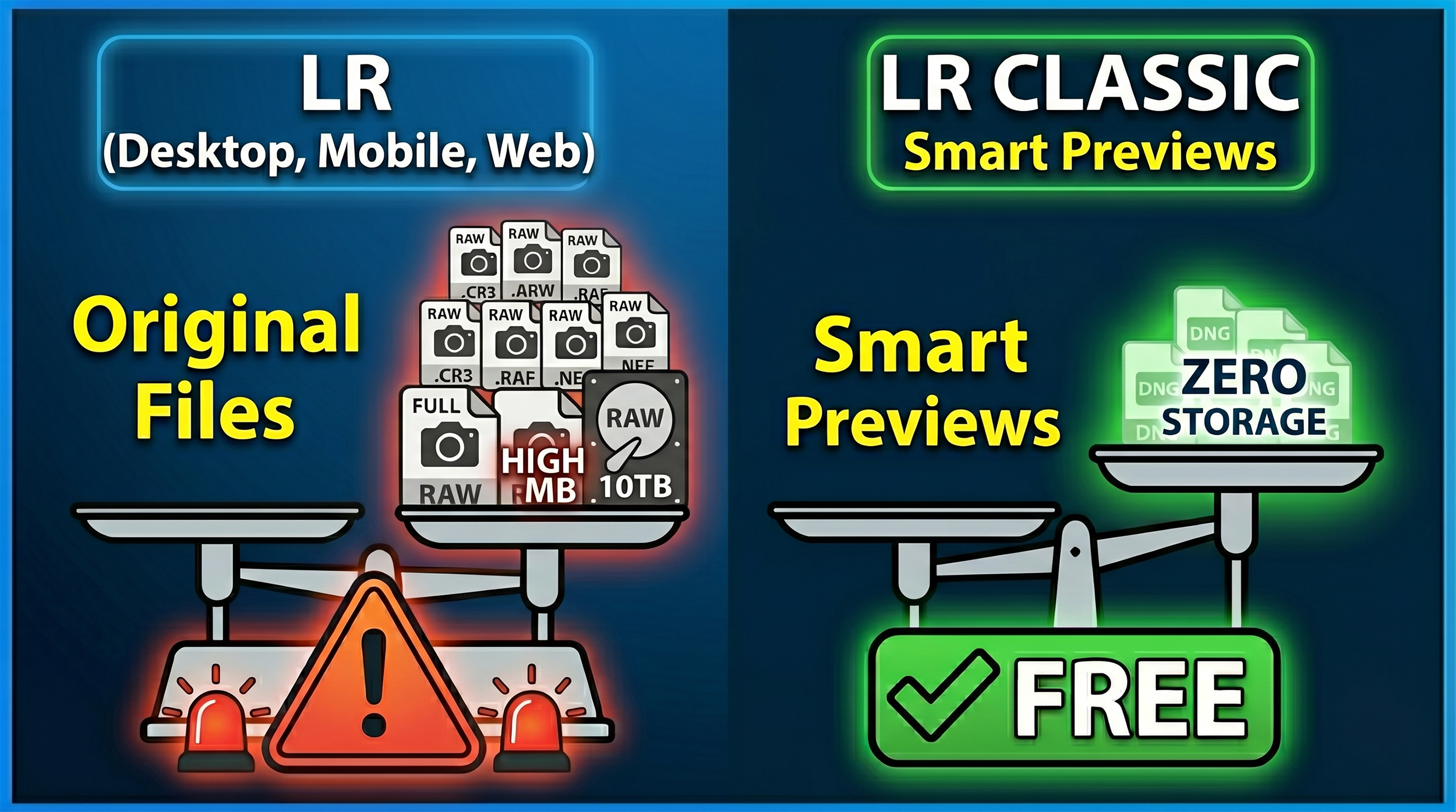
When you copy photos to the cloud using Lightroom Desktop or Mobile, you're uploading the original file, whether that's a RAW or a JPEG.

  • Cloud storage: This counts against your Adobe storage allowance. Every file you add uses the same amount of space as the original. Upload 100 RAW files at 25MB each and you've used 2.5GB of your plan's storage, whether that's 20GB or 1TB.

  • What your “client” downloads: A full-resolution JPEG. The pixel dimensions match your original, so a 24-megapixel file stays 24 megapixels. Adobe converts the RAW to JPEG for delivery, so a 24MB RAW might come down as a 4 to 8MB JPEG, but the detail is all there.

Official Adobe Reference: You can read the storage rules directly in the Adobe Help: Lightroom Cloud Storage FAQ. Look under the "How does storage work in Lightroom?" section, which details how original files consume your plan's space.

Syncing from Lightroom Classic

When you tick the Sync with Lightroom box on a Collection inside Classic, your original files stay on your hard drive. What goes up to the cloud is a Smart Preview.

  • Cloud storage: This uses none of your allocated storage. Adobe syncs these Smart Previews completely free of charge, and they count for nothing against your 20GB or 1TB limit.

  • What your “client” downloads: A reduced-resolution JPEG, capped at 2560 pixels on the longest edge. That's it. Because the cloud only holds the Smart Preview, that's all anyone can download.

Official Adobe Reference: This storage exception is outlined in the Adobe Help: Sync Lightroom Classic with Lightroom Ecosystem guide. Check the "Sync overview" and the "FAQ" at the bottom, which explicitly states that Smart Previews do not consume your cloud storage quota.

Quick Summary

If you're sharing a web gallery and have Allow Downloads switched on, what your viewer receives depends entirely on where the file came from:

  • Lightroom Desktop or Mobile as the source: Uses your cloud storage. Viewer downloads a full-resolution JPEG.

  • Lightroom Classic Collection as the source: Uses zero cloud storage. Viewer downloads a 2560px JPEG, maximum.

Official Adobe Reference: The download behavior for shared galleries is documented in the Adobe Help: Share Photos and Albums from Lightroom Web guide under the "Allow downloads" and "Shared Album Settings" toggles.

The practical takeaway is straightforward; if your “clients” need full-resolution files, upload via Lightroom Desktop or Mobile and keep an eye on your storage. If they just need to view images or grab web-sized copies, syncing from Classic is far more efficient and won't touch your storage allowance at all.

The Smart Way to Use Lightroom Shared Albums

My next project involves my local harbour and town, Lyme Regis in the southwest of the UK where I’ll be photographing the people who truly make the town what it is - the fishermen, cafe owners, restaurateurs, B&B hosts, ice cream sellers, and anyone else who steps in front of my camera.

Because a project like this has a lot of moving parts, I want the process to be completely frictionless. I need a seamless way for the people I photograph to access their portraits without chasing email addresses or risking sending files to the wrong person.

The perfect solution is the Share function in Lightroom. Whether you use Lightroom Desktop, Lightroom Classic, or Lightroom Mobile, this feature turns your cloud-synced albums into functional web galleries.

Here is exactly how to set it up and make it work for you.

1. Getting Your Images into the Cloud

To share an album, the images must be in the cloud so Lightroom can generate a web page.

  • In Lightroom Desktop (Local Tab): If you keep files offline on hard drives, you can easily select a single image, multiple images (using Shift or Command/Control), or an entire folder. Right-click and choose Copy to Cloud. You can then add them to an existing folder or create a new album.

  • In Lightroom Desktop (Cloud Tab): Simply click the + icon next to Albums and select Create Album. You can create an empty album and drop photos into it later.

  • In Lightroom Classic: You work with Collections instead of albums. Create a new collection, give it a name, and ensure you check the box that says Sync with Lightroom.

Once synced, any collection from Classic or album from Desktop automatically populates across the entire cloud ecosystem, including Lightroom Mobile.

2. Managing Share Settings and Permissions

Once your album is in the cloud, right-click the album name in Lightroom Desktop and choose Share and Invite. This generates a dedicated web address for your gallery. Before sending it out, you can completely customize the experience.

  • Link Access: Set the permissions to public or private depending on your audience.

  • Settings & Interaction: You can allow viewers to download JPEG versions of the images, which is exactly how I handle the I Am Lyme project. You can also let them like and comment (which requires a free Adobe account) or toggle metadata and location visibility.

  • Submitting Photos: There is an option to allow others to add photos to the album. This is brilliant if you are hosting a photo walk and want everyone to contribute their shots to a single gallery.

  • Customization: You can alter how the page looks to visitors without changing your internal album settings. Change the display title, hide or show the author name, choose the layout grid (photo grid, column, or one-up), and switch between light and dark themes.

3. Sharing via Lightroom Mobile (and the QR Code Secret)

If you are out in the field like me, using Lightroom Mobile on your phone is the ultimate workflow hack.

Open your synced album on your mobile device, tap the Share icon in the upper right, and you will find the exact same options available on desktop.

The real magic here is the QR Code option. Lightroom Mobile can generate a unique QR code for that specific web gallery. You can show it directly on your screen for someone to scan, or download the QR code to your camera roll to print out. People can scan it, instantly view the gallery, and download their photos on the spot.

4. The Workaround for Pure Lightroom Classic Users

If you strictly use Lightroom Classic and prefer not to use Lightroom Mobile or the Desktop app, you can still easily use this feature.

Once you have created your collection and checked the Sync with Lightroom option, open your web browser and go to lightroom.adobe.com. Log in, find your synced collection under your albums, and click the Share icon on the right side. You will have full access to the web link and the QR code generator right from your browser.

Using shared albums keeps your client interaction simple, organized, and professional. Give it a try on your next project, and let me know if you have any questions in the comments below.

Photoshop's NEW On-Device AI Remove Tool

Adobe shipped Photoshop 27.7 on the 19thMay 2026, and tucked inside it is one of the more genuinely useful quality-of-life features I've seen in years: the ability to run the Remove tool's generative AI model entirely on your own hardware.

For photographers and retouchers, that means object removal that's faster, works offline, and keeps sensitive client work on your own machine.

What the Remove Tool Actually Does

The Remove tool sits alongside the Healing and Clone tools as Photoshop's go-to way of erasing distractions. You paint over something you don't want, a stray tourist, a power cable, a logo, a blemish, and Photoshop fills the area with believable pixels sampled and synthesised from the surroundings.

In the current version there are effectively three flavours of Remove.

Standard Remove (Generative AI off)

Uses content-aware style algorithms, processed locally. It works well on simple, repeating backgrounds, but it can struggle with complex textures and edges.

Cloud Generative Remove (Generative AI on, Cloud)

Sends your selection to Adobe's servers, where a Firefly-class model generates new pixels to fill the gap. It generally performs better on complex scenes with fine detail, like foliage, hair and signage.

On-device Generative Remove (Generative AI on, Device)

New in Photoshop 27.7. A generative model is downloaded to your computer so the Remove tool can do that heavy lifting locally instead of relying on the cloud.

Functionally, on-device mode aims to give you cloud-quality results with the reliability of local processing.

Why Bother With On-Device Remove?

If Remove already runs in the cloud, why bother with on-device at all? Three reasons.

Speed and responsiveness

In on-device mode, the model runs directly on your GPU rather than making a round trip to Adobe's servers. On powerful machines that means noticeably snappier results, especially on large layered documents or when you're doing lots of small removals across a full shoot.

It works when you're offline

Cloud Remove simply doesn't function without an internet connection. If you're editing on a train, in a remote landscape, in a studio with poor Wi-Fi or at a client office behind a locked-down network, that's a problem. On-device Remove works exactly the same way whether you're online or offline.

Better privacy and data control

Some jobs involve embargoed campaigns, confidential documents or sensitive subjects. In those situations it's often preferable, or contractually required, to keep all processing on your own hardware. On-device Remove keeps the pixels on your machine, which can be an important reassurance for privacy-conscious clients.

The Catch: The Hardware Bar Is High

Running a generative model locally is demanding. Photoshop checks your system automatically, and if it doesn't qualify, the Device option in the Remove tool is simply greyed out.

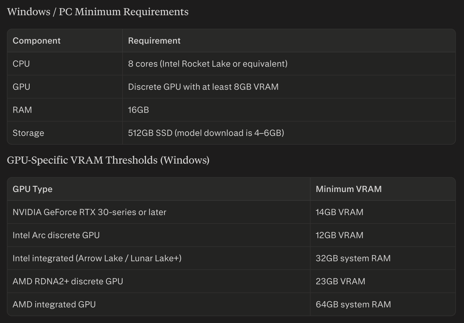
On Windows, Adobe's current guidance calls for a modern multi-core CPU, a strong GPU, and decent RAM and SSD space:

On top of that, Adobe lists higher VRAM thresholds by GPU family. Current documentation and support posts indicate that many mid-range GPUs, some RTX 30-series cards with 12GB of VRAM for example, still don't unlock the Device option for Remove, even though they run other AI features comfortably.

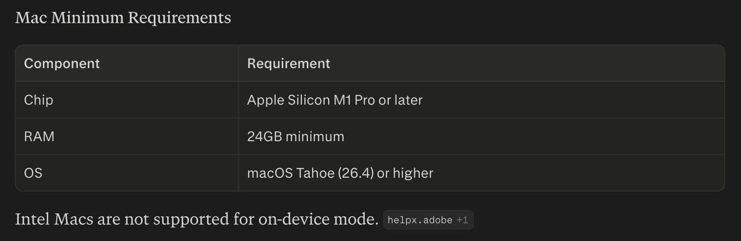
On Mac, on-device Remove is Apple Silicon only. You'll need an M1 Pro or later (M1 Max, M2 Pro, M2 Max and newer are recommended for smooth use), 24GB of RAM or more, and macOS Tahoe (26.4) or newer. Intel Macs aren't supported for the on-device model.

How to Use the On-Device Remove Tool

Once your hardware qualifies and you're running Photoshop 27.7, it's all controlled from within the Remove tool itself.

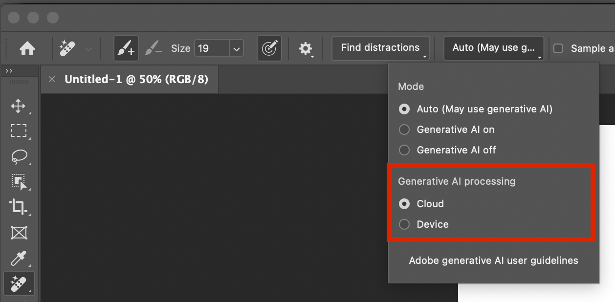
  1. Select the Remove tool from the toolbar, where it sits with the Spot Healing Brush and Healing Brush.

  2. Open the Mode dropdown in the Options bar, where you'll see options such as Auto, GenAI On and GenAI Off.

  3. Choose Device for Generative AI processing. Within that panel, find the Generative AI processing setting and switch it from Cloud to Device.

  4. Download the on-device model. The first time you select Device, Photoshop prompts you to download it, just under 5GB. Confirm it and let it finish.

  5. Paint away distractions. With Device selected, paint over unwanted objects as usual, and Photoshop will use the local model rather than the cloud to generate the replacement pixels.

  6. Switch between Cloud and Device whenever you like, from the same Mode dropdown, if you want to compare quality or fall back to the cloud on less powerful hardware.

If the Device option stays dimmed, it usually means either your hardware doesn't meet the minimum spec or GPU acceleration is switched off in Photoshop's Performance preferences.

Who Will Benefit Most?

On-device Remove is particularly valuable for three groups.

Location, travel and event photographers

You often edit in the field or away from reliable internet. On-device Remove keeps your clean-up workflow working exactly the same wherever you are, hotel room, train, remote shoot or studio with spotty Wi-Fi.

High-volume retouchers

If a big chunk of your day goes on removing logos, stray hairs, dust, cables and background clutter, a faster, offline, privacy-friendly Remove tool makes that daily work smoother and more predictable, especially on time-critical jobs.

Commercial and editorial shooters with sensitive work

When you're dealing with unreleased campaigns or sensitive subjects, being able to say all the retouching was done on-device is a genuine advantage with clients and legal teams.

For casual users on modest hardware, the existing standard and cloud Remove modes will carry on doing the job perfectly well. But if your machine meets Adobe's on-device requirements, the new Remove model in Photoshop 27.7 is one of the most meaningful quality-of-life upgrades in the current release, especially if you live in the Remove tool all day and want its full power without always depending on the cloud.

How to Edit and Export True HDR Photos in Lightroom

Mention HDR to most photographers, and they immediately picture the overprocessed, crunchy trend from 2010 or complex, multi-exposure bracketing. True HDR is different. It uses a single image to unlock the actual brightness and tonal capabilities of modern screens.

This step-by-step guide covers how to edit, export, and share true HDR images using Lightroom Mobile, Desktop, or Classic.

Step 1: Check Your Screen Compatibility

Before editing, you need to know if your device can actually display high dynamic range.

  • Many modern screens (like iPhones, iPads, and MacBook Pros) support it, but standard monitors do not.

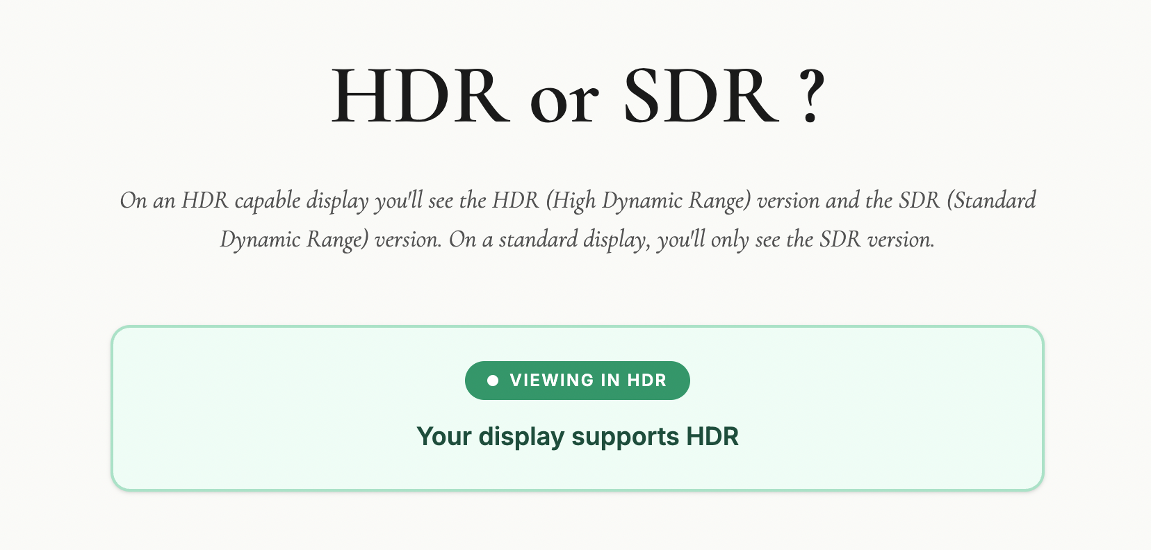
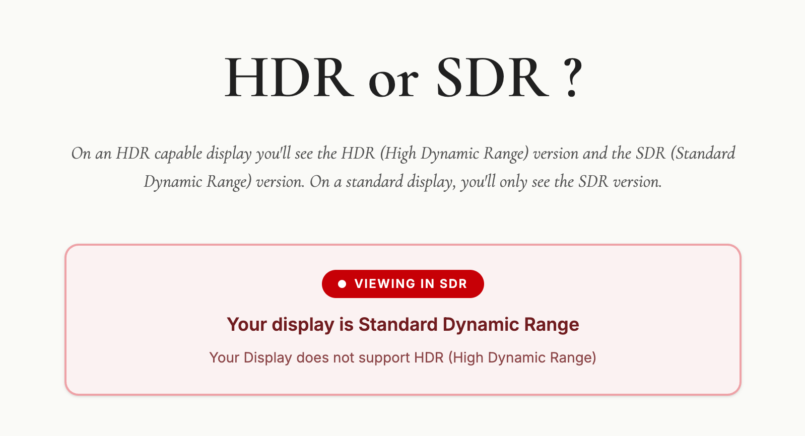
  • If you view an HDR compatibility test page and see two distinct versions of the comparison images, your screen is ready for HDR editing.

Step 2: Edit Your Base Image (SDR)

Start by editing your photo exactly how you normally would. Tweak the exposure, contrast, and colours until you are completely happy with the standard dynamic range (SDR) version. Photos with naturally high contrast and bright highlight areas work best for this process.

Step 3: Enable the HDR Panel

  • Locate and toggle the HDR button in the Lightroom edit panel.

  • The image will instantly become brighter, and your histogram will expand to the right, showing extra sections. These sections represent the additional stops of light available exclusively for HDR displays.

Step 4: Control Your Highlights

To keep the image looking natural and intentional, you need to manage the extra brightness.

  • Stick to the limit: Adobe sets a default HDR limit of around 2.3 stops. Keeping it here ensures your image translates well across different devices.

  • Check for clipping: Hold your finger down on the screen while adjusting the exposure slider (or hold Alt/Option on desktop). The screen will turn yellow to show safe HDR highlights, and red if you push them too far.

  • Visualize HDR: Toggle this feature on to see a colour-coded map of your highlights, helping you stay within safe tonal boundaries.

Step 5: Export with the Right Settings

To ensure Instagram and web browsers can read your HDR data, use these specific export settings:

  • File Type: Select AVIF (or JXL).

  • Color Space: Choose Display P3 (or HDR P3 on desktop).

  • HDR Output: Ensure this toggle is turned ON.

Step 6: Post to Instagram Safely

When sharing your final image to social media, keep these two rules in mind to avoid rendering glitches:

  • No stickers or text: Adding music to your post is fine, but do not overlay native Instagram text or stickers onto the image, as it breaks the HDR rendering.

  • Use the Carousel Trick: Share both the standard SDR version and the new HDR version in a single carousel post. Allowing users to swipe between the two creates a massive, undeniable visual impact.

HDR in Photography: Dead, Dated, or Ready for a Comeback?

For years, HDR in photography has carried a bit of baggage.

Mention it to most photographers and they'll immediately picture those crunchy, overcooked images from the early 2010s. Glowing edges, strange colours, and a look that screamed "processing" louder than the actual subject. And honestly, fair enough. That version of HDR put a lot of people off, and for good reason.

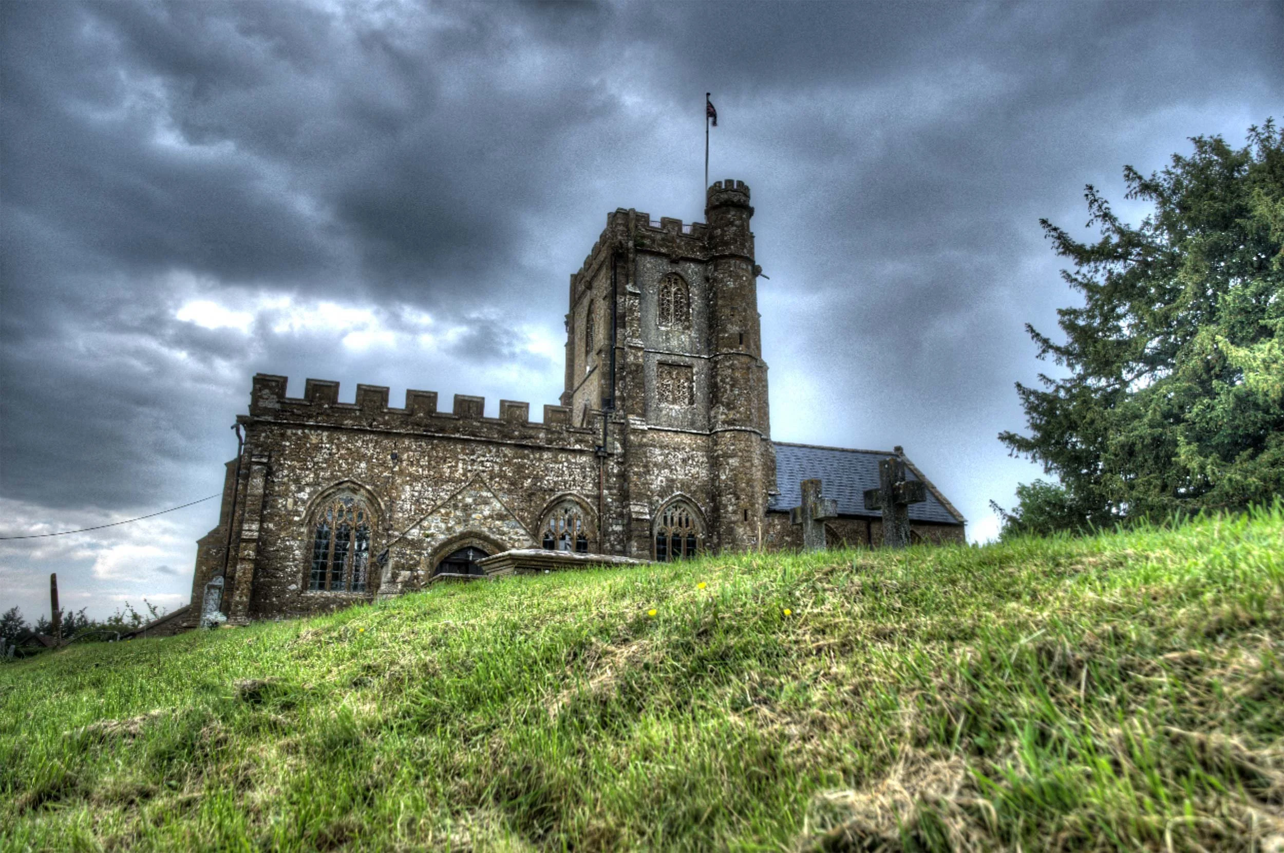
The “HDR” Trend back in the early 2010s

But here's what's changed: HDR isn't what it used to be.

What we're talking about today is not that old exposure-blended, tone-mapped look that most of us learned to avoid. This is proper HDR editing, pulling more out of the image's dynamic range and displaying it on screens that can actually show it. It's less about creating a dramatic effect and more about giving the image room to breathe.

That distinction changes the conversation completely.

So what is HDR now?

At its simplest, HDR means high dynamic range; more tonal range than a standard dynamic range image can show. It’s not blending images together, it’s having the ability to really show what already exists in that file.

That sounds technical, but the practical version is straightforward. Think about a scene with a blazing sky, deep shadows, and subtle detail in between. In a standard SDR workflow, you end up squeezing all of that into a smaller box. You protect the highlights, lift the shadows, and find some kind of compromise.

With modern HDR editing, you're not forcing that compromise in the same way. You're working in a way that allows more brightness information to survive the edit, so when viewed on an HDR-capable screen, the image can look much closer to what the scene actually felt like.

That's the key difference.

This isn't about making everything loud. It's about giving the image more range.


Check out this web page I put together to check if your display / device is capable of HDR.

Take a look on your computer, mobile and tablet device (if you have one)

🔗 LINK: hdrviewer.lovable.app


Why the old HDR got a bad name

Let's be honest: old-school HDR deserved a fair amount of the criticism it got.

A lot of it was used as a shortcut to rescue badly exposed images, and the results were often heavy-handed. Software like Photomatix, which was the go-to tool for HDR processing back in those early days, made it incredibly easy to push things too far. Shadows were crushed, highlights flattened, and that distinctive grungy, over-cooked look became almost a signature of the era. At its worst, it was gimmicky. You knew exactly what you were looking at the moment you saw it.

Worth saying though: Photomatix is still around and still a perfectly viable option. Used with some restraint, it's capable of much more conservative, natural-looking results than its early reputation might suggest. But back then, subtlety wasn't really the point for a lot of people using it.

That's why many photographers developed a kind of instinctive resistance to anything labelled HDR.

But modern HDR is a different thing entirely.

It's not trying to shout at you. It's trying to reveal more subtlety. And when it's done well, most people won't even register that they're looking at an HDR image. They'll just think it looks rich, deep, and beautifully displayed.

Who is actually doing this?

More people than you might think.

The biggest shift is that the industry around HDR has finally started to catch up. More screens support it, editing software is building in proper HDR workflows, and image sharing is slowly becoming more compatible. That matters, because a workflow only becomes genuinely useful when you can see the result and actually share it.

Photographers are already experimenting with it in landscape work, cityscapes, interiors, sunsets, and any scene where the contrast is simply too much for a standard file to hold comfortably. It makes particular sense when the subject contains bright highlights that you want to keep bright, without the rest of the image falling apart around them.

So yes, people are doing it. Not everyone, and not for every image. But enough that it's moving from niche curiosity toward something more mainstream.

Why it matters now

This is where HDR becomes genuinely interesting from a photographer's point of view.

We've reached a point where many viewers already have HDR-capable phones, tablets, laptops, televisions, and monitors. The image you edit is no longer always limited to the old one-size-fits-all SDR world. Some people can actually see more of what you intended when you made it.

That opens up real creative possibilities.

A sunset can hold brighter light without clipping into mush. A window-lit interior can keep detail outside without destroying the atmosphere inside. A seascape can carry that glowing, luminous quality we often try to suggest with standard editing but don't always fully achieve.

In the right hands, HDR isn't flashy. It's expressive.

Where it fits in a workflow

The best way I think about HDR is this: it's another tool, not a replacement for everything else.

It won't suit every photograph. Some images are better left in a standard workflow, particularly if the scene is already well contained or if you want a classic, controlled look. HDR also won't make much difference if your audience is mostly viewing on SDR screens.

But for the right image, it can be brilliant.

The skill, then, isn't just learning how to switch HDR on. It's knowing when it adds value and when it doesn't. That's usually where good photography lives anyway. Not in using every feature available, but in using the right one at the right time.

Is HDR the future?

I think so, yes. Just not in the old dramatic sense.

We're not heading back to the days of overprocessed HDR everywhere. That era is done, and rightly so. But we are moving towards a more natural, more display-aware way of working, where HDR becomes a normal part of the photographic toolbox rather than a novelty.

How quickly that happens depends on a few things catching up together: displays, software, and sharing platforms. But the direction is clear.

More of the world is becoming HDR-capable, which means photographers will increasingly need to understand how to work with that reality, whether they choose to or not.

Final thoughts

HDR is not dead.

What's dead is the old caricature of it. The version that turned every photo into a neon soap opera. The modern version is far more interesting, far more useful, and far more in step with where technology is heading.

For photographers, the opportunity is simple: start paying attention now. Learn what modern HDR actually is, watch how it develops, and think about where it fits in your own work, because this feels less like a passing fad and more like a genuine shift in the way images are made and seen.

Lightroom Virtual Summit 2026

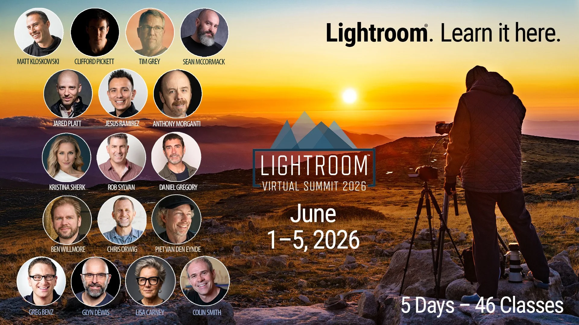
The Lightroom Virtual Summit is BACK running from 1st June to the 5th June 2026, including 45 classes (33hrs +) of Lightroom Education which you can watch completely for FREE!

🚨 Link for FREE PASS: https://glyndewis.krtra.com/t/e7YtyIDicEoQ

InstructorS

Anthony Morganti, Ben Willmore, Chris Orwig, CliffordPickett, ColinSmith, DanielGregory, GregBenz, JaredPlatt, Jesús Ramirez, Kristina Sherk, LisaCarney, Matt Kloskowski, PeterMorgan, RobSylvan, Sean McCormack, TimGrey ... and yours truly 😃

FREE TO WATCH

All classes are free to watch for a 48 period once they go live, and there’s an optional VIP Pass available for purchase that gives you lifetime access to the recordings of all classes, instructor-provided class notes and exclusive bonuses (including additional videos).

Lightroom AI - You're using it in the WRONG ORDER

In Lightroom Classic, Desktop, and Camera Raw, a yellow warning icon often appears in the AI Edit Status panel. This happens when you perform edits out of the recommended "order of operations," signaling that certain AI-generated layers need to be updated or rerendered.

While you can still edit in any order, jumping around can lead to unpredictable results. For example, applying an adaptive color profile and then using the "Denoise" or "Remove" tool might cause the colors and highlights to shift once the AI is forced to update.

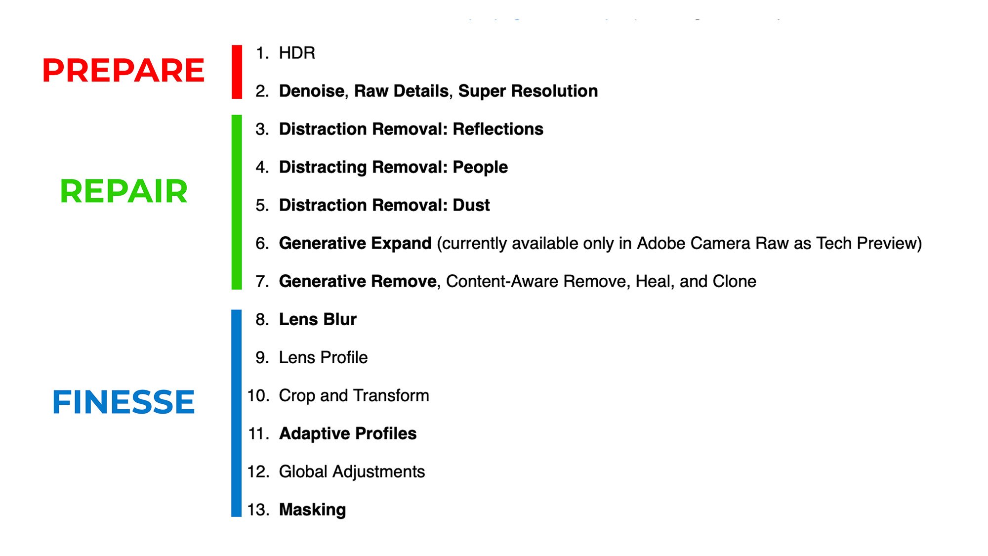
The Recommended Workflow: Prepare, Repair, Finesse

To maintain total control over how your image looks, it is best to follow this three-step sequence:

  1. Prepare: Start with edits that affect the entire image, such as Denoise, Raw Details, Super Resolution, or HDR. This is the foundation of your edit.

  2. Repair: Next, clean up the image by removing distractions. Use the Remove tool (with Generative AI) or Distraction Removal for things like reflections, dust spots, or unwanted objects.

  3. Finesse (or Finish): Once the image is prepped and repaired, move on to creative adjustments, such as Adaptive Color Profiles or intricate masking.

Handling the AI Edit Status Warning

If the yellow icon appears, it is a reminder that your AI edits may no longer be perfectly synced with the current state of the image.

  • Click to Update: Always click the icon and select "Update" before finishing your edit.

  • Reassess: After updating, look closely at your image. Because the AI is rerendering, the results might look slightly different than before.

  • Don't Just Export: If you try to export while the icon is yellow, a popup will warn you. Instead of clicking "Export" anyway, it is safer to cancel, update the edits manually, and ensure you are happy with the changes before saving the final file.

By following the Prepare, Repair, Finesse order, you ensure your editing remains predictable and that the final export looks exactly as you intended.