Display P3 is essentially a more desktop-friendly variant of that cinema colour. It uses the same P3 primaries, but adopts the D65 white point shared by sRGB and Adobe RGB, and an sRGB-like transfer curve (roughly gamma 2.2), making it better suited to normal monitor and device viewing.
How it compares to Adobe RGB
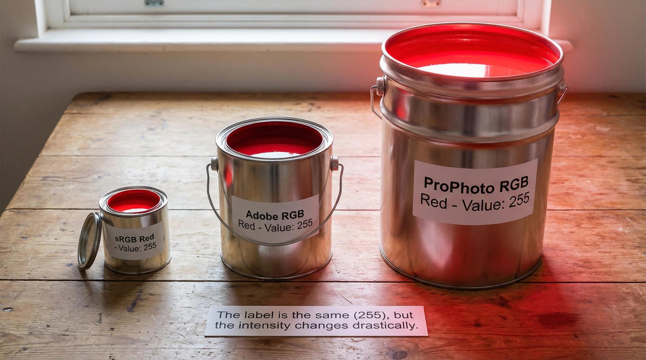
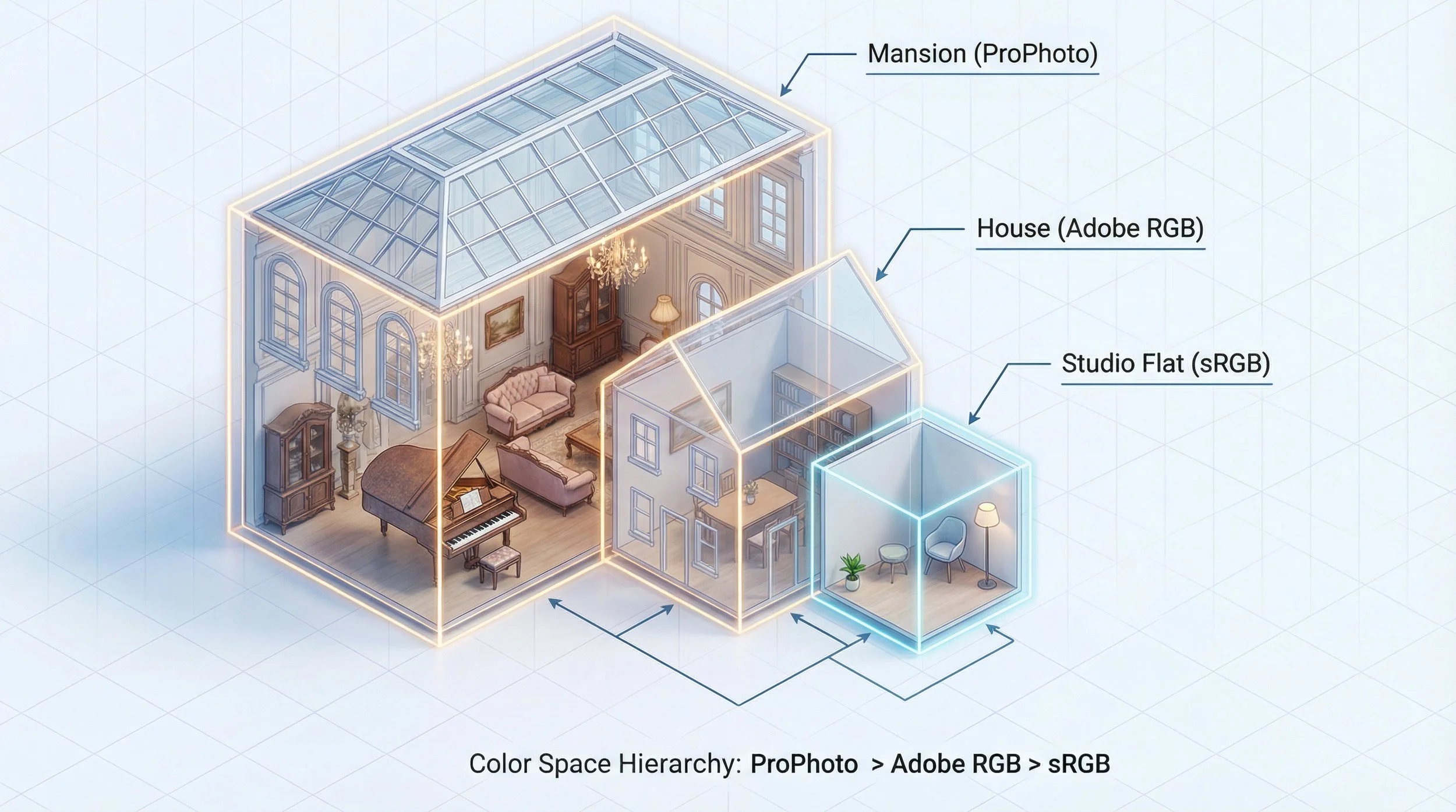
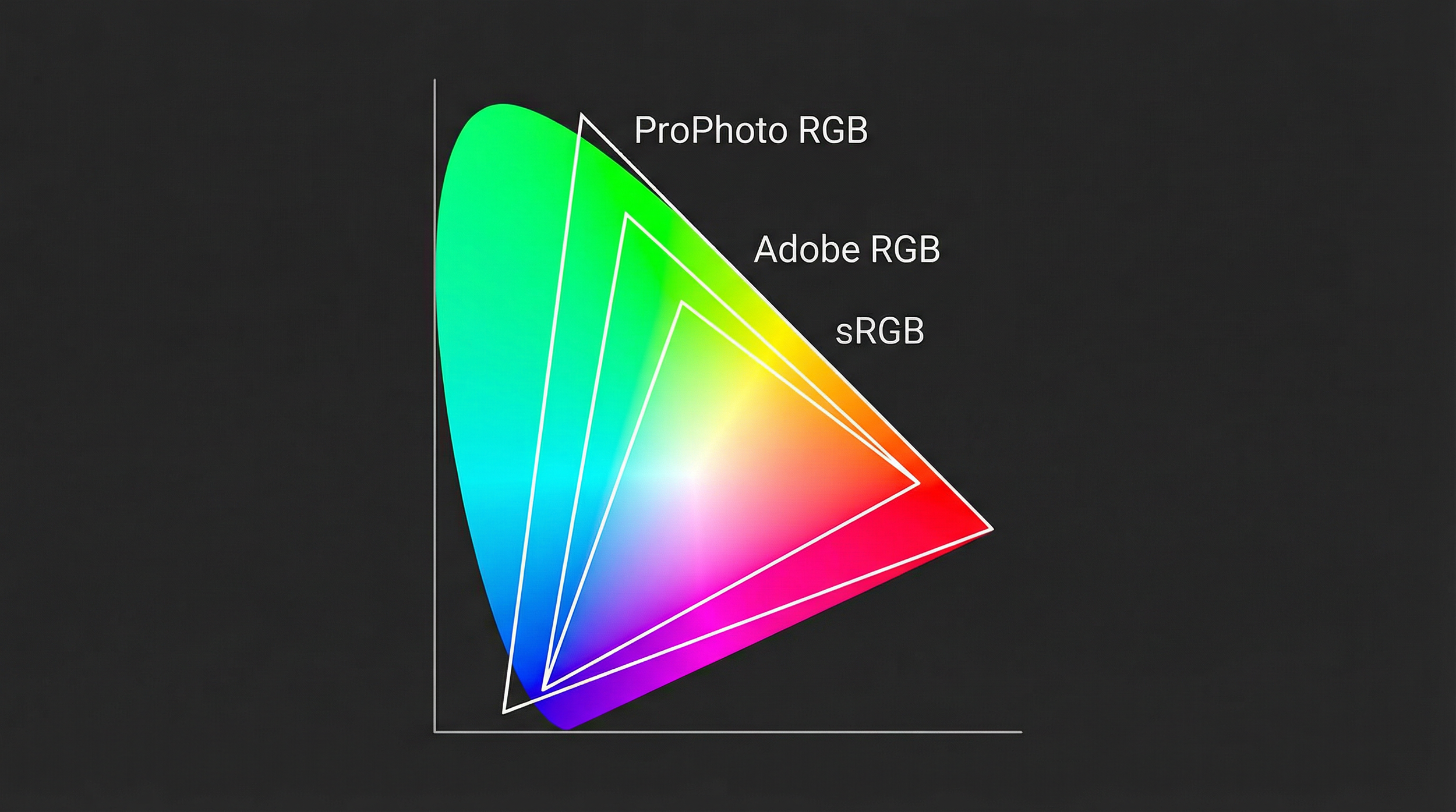
Adobe RGB and Display P3 are both wide-gamut spaces of similar overall volume, but with different shapes.
Adobe RGB reaches further into deep greens and blues, which is why it has long been favoured for print workflows where those hues matter and where printers and papers can take advantage of that gamut
Display P3 pushes more into richly saturated oranges and reds, while not extending quite as far as Adobe RGB in some green-blue regions
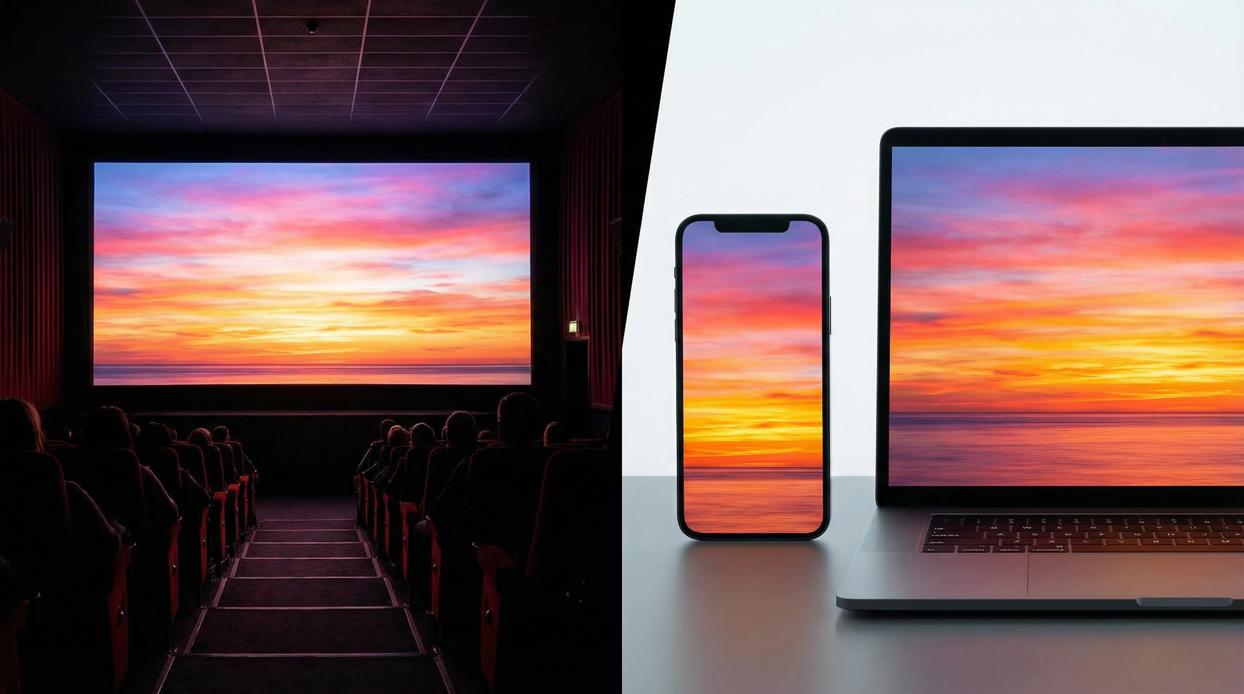
Use case: If you are creating content primarily for modern wide-gamut smartphones, tablets, and laptops that support Display P3 and are properly colour-managed, working in Display P3 lets you use colours that go beyond sRGB, so images can look more lifelike and vibrant on those devices. On older or strictly sRGB-only screens, though, those extra colours are either mapped back into sRGB or clipped, so the advantage largely disappears.
Which one should you use?
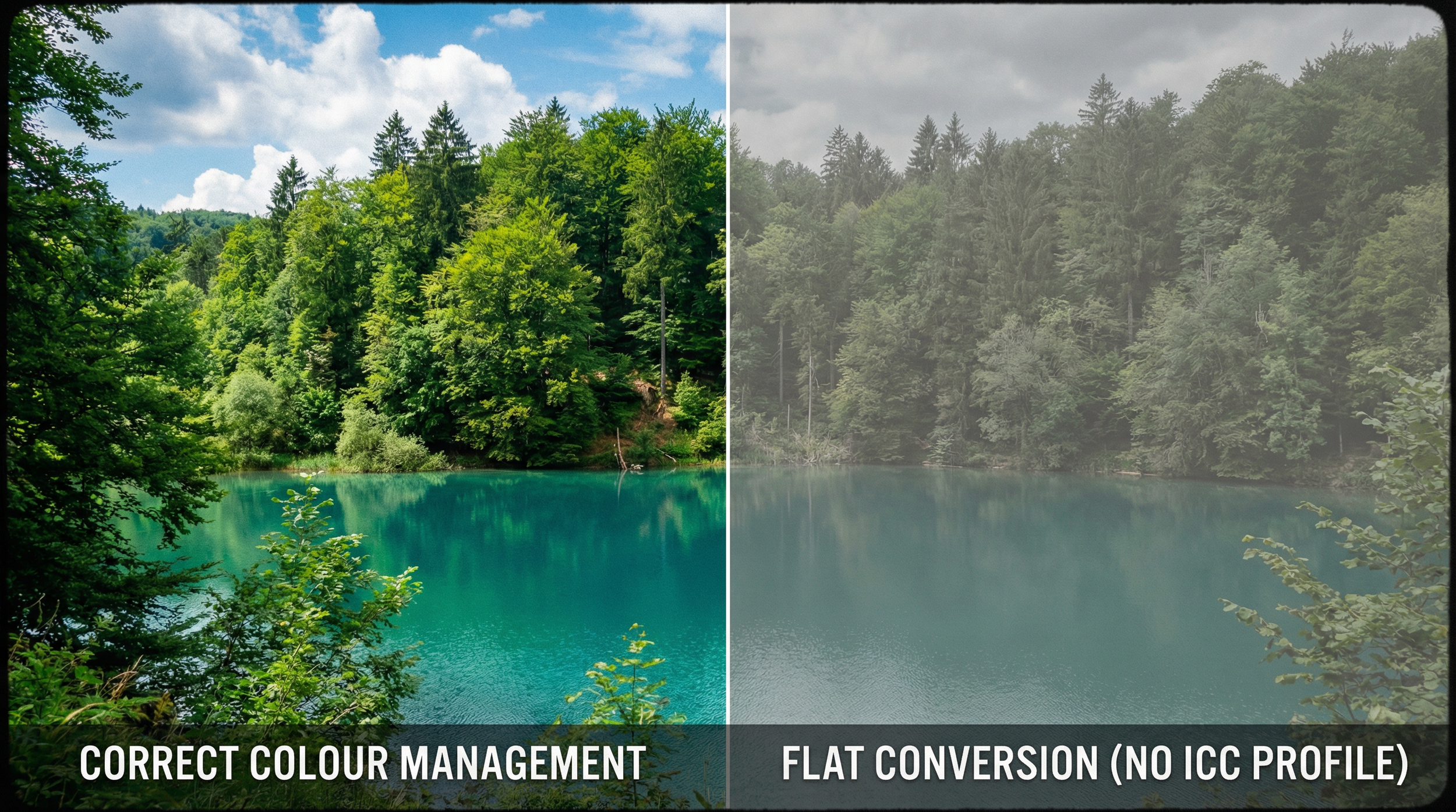
A simple, robust way to stay sane is to separate "editing space" from "delivery space." During RAW editing, using a very wide-gamut space like ProPhoto (or Lightroom's ProPhoto-based internal space) in 16-bit keeps as much colour information as possible while you make adjustments. When you are finished and ready to share or upload, you convert a copy of that master to sRGB (or to Adobe RGB/P3 if you are targeting a fully colour-managed, wide-gamut environment), so it looks correct on most people's devices.
This approach gives you a master file that preserves the widest feasible gamut for future prints or re-edits, plus final exports tailored to where the image will actually live (web, print, or video) without sacrificing consistency for your viewers.
Creating a print master in Adobe RGB
When it's time to take an image off the screen and put it onto paper, I often convert my files to Adobe RGB as a dedicated "print master." It might seem like an extra step, but there is a very practical reason for it: it gives the print system more of the colours that high-quality printers can actually reproduce, especially beyond plain sRGB.
Matching what the printer can really do
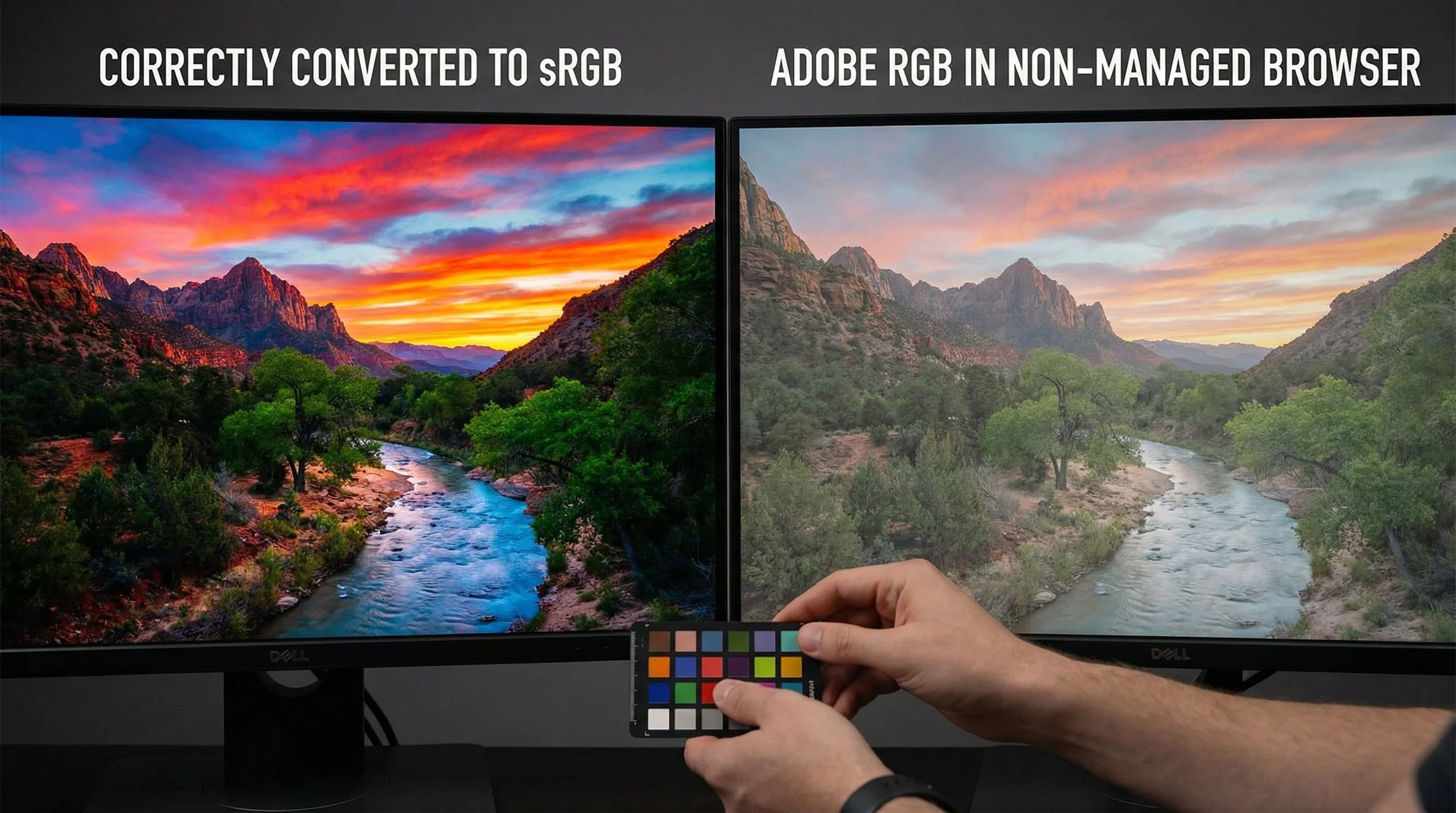
Many modern high-quality inkjet and lab printers can reproduce certain colours (particularly some vibrant cyans, deep blues, and rich greens) that extend outside the sRGB gamut. If a scene or RAW file contains those more saturated hues, converting everything into sRGB first can compress or clip them before the printer even gets a chance to do its job, so the print may not show all the nuance that was originally captured.
By keeping the editing in a wide space (like ProPhoto RGB or Lightroom's internal MelissaRGB space, which uses ProPhoto-based primaries) and then creating a print file in Adobe RGB, the file can still describe many of those "extra" printable colours that sRGB would squeeze in.
In real-world terms, this often shows up as:
Bridging the gap to CMYK
The ink in a printer behaves very differently from the light on your screen: monitors work in RGB (Red, Green, Blue), while printers work in CMYK (Cyan, Magenta, Yellow, Black) or multi-ink variants. A printer's CMYK gamut has a lumpy, irregular shape. There are regions, especially in certain blue-green areas, where it stretches outside sRGB, and other regions (like very bright, saturated oranges and yellows) where it is actually smaller than sRGB.
Adobe RGB was designed to better encompass typical CMYK print gamuts, so it overlaps much more closely with the colours high-quality printing systems can produce. It does not literally "cover every possible CMYK colour," but it does include most of the printable colours that sit outside sRGB, which means you are less likely to be "leaving colour on the table" when you hand a file to a good, colour-managed print workflow.
How this fits into a print workflow
Edit in a very wide-gamut space (e.g., ProPhoto RGB or Lightroom's MelissaRGB internal space) to keep as much colour information from the RAW as possible while you do the heavy lifting
Create a print master in Adobe RGB once the edit is finished, so the file aligns better with what many high-end printers and papers can show than sRGB does
Match the lab's requirements, since some pro and fine-art labs prefer Adobe RGB (or accept ProPhoto), while many consumer or high-street labs still expect sRGB only