
adobe

Capture to Print: One-Light Complete Portrait Workflow

For the past three months I've been touring with Wex Photo Video around the UK on their Summer Roadshow, showing how I take portraits with minimal kit in limited space. I came away with portraits I'm really happy with from every date, but there was one look in particular I was asked about more than any other, so I asked my friend Michael if he'd sit for me and we went outside with one small flash to make it again.

The video above goes through the whole thing, from the shoot, through every step of the edit in Lightroom and Photoshop, to a finished print. Here's an overview of what's in it.

One small flash, outdoors

The idea is simple. Before the flash comes into it at all, I set the camera so that it doesn't see any ambient light; take a picture and you get a black screen. That way the only light in the final shot is the light I put there.

Outdoors in bright sun that takes a bit more doing than it does in a store. I ended up at f/16, which was as far as the lens would go, around ISO 125 and 1/250th of a second, keeping within the flash sync speed rather than reaching for high speed sync or ND filters. I did wonder whether a 100 watt second light could cope with sun that bright, but it wasn't a problem.

The kit was:

  • the Westcott FJ100 on power 9, so pretty much full power

  • a 15 inch octa with the grid fitted

  • a pistol grip handle to hold it steady

  • the camera on a tripod

  • a reflector just below chest level

The camera goes on a tripod so Michael has one fixed point to look at, rather than following me around as I move, and I trust the eye autofocus to nail the focus so I don't need to be right behind it.

How the light falls

I raise the light nice and high and get Michael to lean forward a little towards the camera. Because of the grid, the light doesn't go everywhere; it comes down and skips across the front of his face, and it doesn't spill onto the background, which I wanted to keep dark.

What I really like about it is that the light is so directional you get shadow either side of it, so it's almost like having a strip of light running down the front of the face. It's a look I definitely want to work more on.

The one thing that made the biggest difference was the reflector. Flat and horizontal, it did very little for the eyes. Lift the far end so it's angled up towards him and the light bounces back into his face, and suddenly there's plenty of detail in the eyes to work with.

The edit in Lightroom

Only one job happens in Lightroom, and that's the eyes. I use masking to select the iris and pupil, finesse the mask with the feather and edge sliders so it sits just inside the eyes, then lift the exposure slightly and add a little texture, clarity and a touch of dehaze. At 100% the difference with the mask on and off is night and day.

After that the image goes over to Photoshop, because that's where the heavy lifting gets done.

The heavy lifting in Photoshop

My rule of thumb here is to look at the image and fix whatever jumps out first. On this one it was the shine down the middle of Michael's nose, which I took out with the Remove Tool on a new layer, then lowered the opacity to around 50% to bring some of the natural shine back. After that I used the Spot Healing Brush on a blank layer to clean up the more obvious marks in the concrete wall behind him, which was sharper than I'd like because of shooting at f/16.

Most of the work is dodging and burning on a 50% grey layer set to Soft Light, with the Dodge Tool at 10% exposure and the Option key (Alt on Windows) held down to switch to the Burn Tool with the same settings. I brighten the highlights and darken the shadows either side of them, around the eyes, down the nose, the eyebrows and the mouth, and then the folds in his top. It sneaks up on you; you often don't see it until you turn the layer off. Working on a grey layer rather than the image itself also means that if you go too far, you can paint over it with 50% grey and it's gone.

From there it's a handful of smaller things:

  • a loose lasso round the teeth and a Hue/Saturation adjustment on the yellows, lifting the lightness slightly so they're cleaner without looking like he's had them done

  • my 2010 technique, two passes of Unsharp Mask on merged layers, amount and radius at 20 then 10 with the threshold at 0, each painted in through a black mask, the first over the middle of the face and the second over the eyes, nose and mouth

  • a skin texture effect using Reduce Noise at full strength with everything else at zero

  • a High Pass layer at a radius of 2, set to Hard Light and placed on top, to bring back the sharpness in the eyes, hair and skin detail that the texture effect softens

The 2010 technique is superb on close-up portraits; it makes the face look as if it's coming forward off the screen, and even more so in print.

Camera Raw and a finishing touch

In the Camera Raw filter I used Lens Blur to soften the concrete wall and give the picture a bit of fake depth of field, brushing blur in around the top of the head, the ears and the shoulders so it feels more like f/2.8 or f/4 than f/16. I still wanted to be able to just about see the wall, so it isn't blacked out completely.

A linear gradient with the exposure brought down takes the edge off the bright top he's wearing, which was pulling my eye, and a radial gradient in the middle of the face at +0.2 exposure adds a little light where it matters. I do that last one on pretty much every portrait.

The finishing touch is a warm colour grade from Optics by Boris FX, using the Titanic look in the Portrait colour section, brought down to 50% opacity.

Making the print

I print pretty much every image I'm happy with onto A4, and this one went onto Fotospeed Natural Soft Textured Bright White 315, a fine art matte paper and one I use most of the time, on the Canon PRO-300.

The steps are:

  • duplicate and flatten the image

  • resize to 10 inches on the long edge at 300ppi

  • soft proof with the paper profile, comparing relative and perceptual rendering intents

  • a slight brightening just for the print

  • save as a TIFF in Adobe RGB

  • print from Canon Professional Print & Layout, with Heavyweight Fine Art Paper as the media type, the paper's ICC profile, perceptual rendering intent and black point compensation on

For this picture perceptual was the clear choice. Relative blocked the blacks up quite a lot, whereas perceptual gave it more contrast, which suited it.

Straight out of the printer it was looking really good, and on a matte paper like this it only gets better once the ink has had time to dry and settle. You can just about see detail in the back wall, which is what I was after, and the 2010 technique does exactly what I hoped, bringing the face forward off the page.

Why I always print

Our screens are fantastic, but it's not until you have something physical in your hands that you can really study it and start noticing the things you missed while editing. I truly believe printing can help you get better as a photographer, and certainly better at retouching.

If you'd like to follow along with the video step by step, the raw file I used is free to download from the classroom in my Photography Community on Skool:
Adobe Now Owns Topaz: Is This GOOD News or BAD?

On the 23rd of September 2026, Adobe completed its purchase of Topaz Labs. If you use Photoshop, Lightroom or any of the standalone Topaz applications, the obvious question is: what does that mean for us?

Will we get better tools? Will more of the technology be included in what we already pay? And what happens if you prefer using Topaz on its own?

There are some answers, but there’s still plenty we don’t know. In the video above, I share my thoughts on the acquisition, where I can see some real benefits, and what I’d personally like Adobe to do next.

What Has Adobe Confirmed?

Adobe announced the proposed acquisition in June. The September announcement confirms that the deal has now gone through.

Adobe says the Topaz brand will remain, and its applications and models will continue to be available as standalone products. If you use Topaz separately, perhaps alongside a different editor, that’s encouraging.

It’s also worth clearing up the subscription question. Topaz introduced its newer subscription offering in September 2025, before this acquisition. Whatever your feelings about subscriptions, that change wasn’t introduced by Adobe buying the company.

Has My Opinion Changed?

Earlier this year, I made a video about the Topaz integration in Lightroom, and I was frustrated.

At the time, it felt as though Adobe could be taking the easier route by bringing in somebody else’s technology. Given Adobe’s experience and resources, I wanted to see what it could develop itself. I still would.

But I can also see the reasoning behind this purchase. Topaz has specialist knowledge and people who have spent years working on image and video enhancement. Bringing that experience into Adobe could be a sensible way to improve the tools we use.

That’s something I probably could have given more weight in my earlier video.

There is, however, one point I still stand by: when I’m working in Photoshop or Lightroom, I want the tools to feel like they belong there. I want them to work together, follow a consistent approach and give me enough control to get the result I’m after.

Changing who owns the technology doesn’t automatically achieve that. It takes development.

Where Could This Benefit Photographers?

The most obvious opportunity is a better editing experience.

Say you’ve cropped a photograph quite heavily and want to make a print. Having a suitable enlargement tool available inside the application you’re already using could be really useful—especially if you can judge the result properly and adjust the processing without a complicated round trip between applications.

That’s the kind of integration I’d welcome.

Adobe doesn’t have to invent every piece of technology from scratch for it to be valuable. What matters is whether bringing these teams together produces something better when we sit down to work on a photograph.

There’s also the possibility of more processing happening on our own computers. Adobe has highlighted Topaz’s NeuroStream technology, which helps demanding AI models run locally.

Depending on how Adobe uses it, that could reduce the need to upload files for processing. But it isn’t a promise that every feature will work offline, or that every computer will suddenly process everything quickly. We’ll have to see how it develops.

Give Us More Control

For me, one of the most useful places to start would be the controls.

The integrated Topaz tools haven’t offered the same experience as the standalone software. The controls have been limited, with what’s available differing between applications and models.

Having the technology available is useful, but I also want some say in the result.

We’ve all had that moment when an adjustment gets close, but isn’t quite right. Perhaps the effect is a little too strong, or some of the detail doesn’t look as natural as we’d like. That’s where being able to refine the processing makes a difference.

It doesn’t have to mean putting every possible slider on screen. A simple option is useful when it gives you what you need. When it doesn’t, I’d like the option to go further.

Adobe hasn’t announced that the acquisition will bring the extra controls I’m asking for. It’s something I’d like to see.

How Does It Fit Into the Lightroom Workflow?

In Lightroom, Generative Upscale creates a separate DNG file, leaving your original photograph intact. Adobe recommends applying it at the end of your editing workflow.

Understanding that you’re creating a new file matters when deciding how to fit the tool into your editing process. Over time, I’d like that process to become as flexible and clear as possible.

There’s also an important distinction between Lightroom and Lightroom Classic. A feature being available in one doesn’t automatically mean it’s available in the other.

At the time of writing, Adobe’s published FAQ says there are no plans to bring this particular Gigapixel integration to Lightroom Classic. That refers to the built-in integration; it doesn’t mean you can’t use the separate Topaz application with Classic.

What About Generative Credits?

This is where the practical questions become particularly important.

At the time of writing, Adobe’s published charges for the integrated tools are:

ToolFinished output sizeCredits per generationTopaz Gigapixel in Photoshop or LightroomUp to 25 megapixels10Topaz Gigapixel in Photoshop or LightroomAbove 25, up to 56 megapixels20Topaz Bloom in Photoshop1–9 megapixels35

These are Adobe generative credits for the integrated features. You can check the current rates in Adobe’s credit table.

If you have several thousand credits each month and use these tools occasionally, that might be perfectly manageable.

But imagine you have 200 credits remaining. At 20 credits a go, that gives you ten generations, assuming you don’t spend any elsewhere.

That’s ten attempts, rather than necessarily ten finished photographs you’re happy with. Generate another version and you use more of your allowance.

The 200-credit figure is just an example. Your allowance and access depend on your plan, so check your own account.

For me, this connects directly with the question of control. When each new generation uses part of your allowance, being able to get a result you’re happy with becomes particularly important.

Could Ownership Mean Better Value?

When one software company uses another company’s technology, there’s usually a commercial agreement behind it. That might involve licensing fees or usage charges.

We don’t know the details of Adobe’s previous agreement with Topaz, so I can’t say how much of the credit charge reflected that arrangement.

But now Adobe owns Topaz, it’s reasonable to ask whether that changes the calculation. Could fewer credits be required each time? Could more usage be included in our existing plans?

There are still costs involved in developing and running the technology. Ownership doesn’t make those disappear.

The acquisition announcement doesn’t promise lower credit charges, either. Better value is something I’d like Adobe to address, rather than something we’ve been told to expect.

Clear pricing, a practical allowance and more control over the result would make this integration more useful.

What I’d Like to See Next

I can see why Adobe has bought Topaz, and I can see opportunities for photographers to benefit.

Closer development between the teams could improve the tools. Local processing is interesting. Better integration could make editing easier. And continuing to offer standalone Topaz products preserves a choice that matters to plenty of photographers.

For me, the test will be what Adobe does next.

I want to see useful improvements, more flexibility and tools that feel like a complete part of Photoshop and Lightroom. If Adobe’s resources and Topaz’s expertise produce that, I’ll be very happy to give them credit.

What do you think? Would you like more of the standalone Topaz controls inside Photoshop and Lightroom, or does the simpler approach already give you what you need? And if you use Topaz separately, what would you most like Adobe to preserve or improve?

Let me know in the comments.

Details reflect the published information checked on 24 September 2026. Features, credit charges and plan allowances may change.

How to Fix Photoshop Scratch Disk Full (once and for all)

This warning has popped up a few times recently when I’ve been using Photoshop, and if you’ve seen it too, you might be wondering what a scratch disk actually is… and what you’re supposed to clear.

So, to accompany the video, I thought I’d put the steps here so you’ve got something to refer back to. There’s also a way to change your scratch disk if Photoshop won’t even open.

First, check which drive Photoshop is using

Before doing anything else, save your work if Photoshop will let you.

Then head to:

  • Mac: Photoshop > Settings > Scratch Disks

  • Windows: Edit > Preferences > Scratch Disks

Look at which drive is selected and how much space is available. That’s the drive we need to check.

You might have another drive connected with loads of room, but unless Photoshop is configured to use it, that space isn’t helping.

What exactly is a scratch disk?

Think of it as extra working room.

Imagine working on a print at a table. The print itself might be quite small, but you still need space around it for everything you’re using.

Photoshop needs that working room too. It uses space on a drive to store temporary information whilst you edit, so the size of your saved photograph doesn’t tell you how much space Photoshop might need to work on it.

There’s also a difference between a warning that space is getting low and an error that stops you opening Photoshop, editing or saving. A warning doesn’t necessarily mean the drive is completely full, but dismissing it doesn’t give Photoshop any more room.

Free up some space

Adobe recommends having at least 100 GB free on your primary scratch drive when troubleshooting this error. That’s guidance rather than a guarantee that every job will fit. Larger projects may need more.

Start with files you recognise: old video exports, downloads or projects you’ve already finished.

If you move them to another drive, check that the copies are there and open properly before removing the originals. And remember, putting files in the Trash or Recycle Bin doesn’t immediately free up the space. Review what’s in there before emptying it.

Once you’ve made room, save your work if you can, quit Photoshop completely and reopen it. Then try whatever you were doing when the warning appeared.

Give Photoshop another drive to use

If storage on your computer is always tight, another option is to give Photoshop a suitable drive with plenty of available space.

I use an SSD as a dedicated scratch disk.

Go back into Scratch Disks, select the drive and, if you’ve selected more than one, use the arrows to set their order. Adobe recommends putting the fastest drive first.

Click OK, then restart Photoshop.

Oh, and changing this setting doesn’t move your photographs. You’re choosing where Photoshop can put its temporary working data. If you’re using an external SSD, keep it connected whilst Photoshop is using it.

What if Photoshop won’t open?

You can’t get into Settings if Photoshop refuses to launch, but there’s a shortcut for that.

Hold these keys whilst launching Photoshop:

  • Mac: Command + Option

  • Windows: Ctrl + Alt

This lets you choose a scratch disk during startup. Select a suitable drive with space available, then continue opening Photoshop.

Don’t add the Shift key. That’s the shortcut for resetting preferences, which we’ll come to shortly.

Of course, if your only drive is full, the shortcut won’t create any extra space. You’ll need to make room outside Photoshop first.

Still getting the warning?

First, double-check that the free space you’re looking at belongs to the drive selected in Photoshop.

Then try quitting Photoshop completely and reopening it. Its temporary working data can build up during a session, and closing your photographs doesn’t necessarily release everything.

A restart can help, but it won’t solve a drive that’s consistently running out of room.

It’s also worth checking History States, under Settings / Preferences > Performance > History & Cache.

This controls how many previous editing steps Photoshop keeps available for you to return to. Keeping more can require more scratch space.

Adobe’s documented default is 50. If you’ve increased yours to several hundred, consider whether you really need that many. Reducing the number may help, but you’ll have fewer steps you can go back to.

Be careful with Purge

You might have seen advice to choose Edit > Purge > All.

This can release memory and scratch space, but understand what it does before clicking it: purging clears temporary editing information, including your history.

It doesn’t return your photograph to its original appearance, but you lose the ability to go back through the history you’ve cleared. You can’t undo the purge.

Save your work first if possible, and treat this as an optional troubleshooting step.

Resetting preferences

If you’ve checked the correct drive, made room and restarted, but the error keeps returning, resetting Photoshop’s preferences is another troubleshooting option.

This can help if damaged preference files are contributing to the problem. It doesn’t create storage, and it can remove your custom settings, so back those up first.

With Photoshop open, go to Settings / Preferences > General > Reset Preferences on Quit. Confirm, quit and reopen Photoshop, then check your scratch disk selection again.

If Photoshop won’t open, hold these keys whilst launching:

  • Mac: Command + Option + Shift

  • Windows: Ctrl + Alt + Shift

That’s the shortcut with the extra Shift key. You’ll be asked whether you want to delete the Photoshop settings file.

Start with the Scratch Disks panel

The main thing is to check which drive Photoshop is actually using and how much room it has. Then free up space or give it another suitable drive to work with.

Make one change at a time and repeat whatever caused the warning. That way, you’ll know what helped.

The video above takes you through where to find everything.

Right, I hope that’s useful.

Glyn

Who is Photoshop for now? 🤷‍♂️ (update 27.10.0)

Here's a question I've been carrying around for a while now, and I still haven't got a tidy answer for it …

Who is Photoshop for now?

For most of the years I've been using it, Photoshop has been the place I go to disappear. I'll open an image with a rough idea of where I want to take it, start working, and the next time I look up properly two hours have gone. That isn't just productivity, it's creative escapism, and I think that deep flow state is why so many of us fell in love with the application in the first place.

Lately though, opening Photoshop feels a bit different. It feels like it wants something from me. It wants me to write a text prompt, it wants me to keep an eye on my generative credit balance, and it seems remarkably keen to show me what it can do without me.

I want to be clear about where I'm coming from. I love Photoshop; it's what I do, it's what I built my career on, and I'm not going anywhere. But when you genuinely care about a tool you pay close attention to the direction it's pointing in, and looking at what's arrived in recent releases like version 27.10.0, I think it's worth having an honest conversation about where things are heading.

Two interfaces and a bit of an identity crisis

There are a few significant shifts in the interface in the newer updates.

The contextual taskbar now has a dedicated Prompt to Edit button, so instead of making a careful selection first, you can prompt changes right across an entire image using various AI models.

Then there's the AI Assisted Editor workspace, which you can enable from the menus. Switch to it and Photoshop strips away your layers, your familiar tools and your adjustments, and replaces the lot with a prompt driven layout that looks and behaves like Adobe Firefly sitting inside Photoshop.

There's also the Pro Editor label. The workspace you and I have used for decades, with its layer stacks, blend modes, masks and smart objects, is now officially labelled the Pro Editor to tell it apart from the AI Assisted mode. Photoshop never used to need a qualifier; it was just Photoshop.

I do understand the logic from Adobe's side. The full Photoshop interface is intimidating for beginners and a simplified prompt box lowers the barrier to entry, but turning the whole canvas into a prompt box disables the very foundation that makes Photoshop worth learning in the first place, which is non destructive layers, precise pixel control, and being able to unpick your creative decisions months down the line.

If someone purely wants to generate an image from text, they've already got dedicated web tools and mobile apps for that. What they don't need is desktop Photoshop with its core strengths stripped out.

Resolution and control

Beyond the workflow philosophy there are some practical hiccups when you lean on whole image generative edits.

Run a full prompt, asking the software to add weather effects say, and it generates an entirely new flattened layer. Even with the recent improvements to generation resolution, the output is often softer and lower in detail than your original camera file.

If you then try to mask through to recover the original sharpness on your subject's face, you run into problems fairly quickly. Perspective shifts, subtle facial alterations and mismatched lighting mean the generated background no longer lines up cleanly with the original capture, so you end up spending extra time fixing blend modes, manually aligning shifted anatomy and correcting colour mismatches, just to make the composite work.

The credit counter

There's another subtle shift that changes how the software feels to use, and that's the generative credit counter.

Adobe have made the right decision by being transparent and showing you exactly what a generation will cost before you press the button; hiding the cost would be far worse. But seeing that meter tick down does introduce a psychological hesitation.

You pause before generating. You wonder whether this variation is worth spending a credit on or whether you ought to save it, and if the result comes back slightly off, you've then got to decide whether a second roll of the dice is worth the cost.

In twenty years of editing I've never opened a Curves adjustment and wondered whether I could afford it. I've never dodged and burned a portrait with a bill running in the corner of the screen. Creativity thrives when you're free to experiment, fail and try again without an active meter running.

The quiet lane and the loud lane

I don't want any of this to sound like a complaint about modern features. In recent updates to Camera Raw, Adobe introduced a new Glow adjustment covering diffusion, bloom and halation. It doesn't need a prompt. It's practical, it's well engineered, and it's built directly for photographers and retouchers, which is Adobe at their absolute best.

Historically Photoshop has moved forward in two lanes at the same time. There's the loud lane, the flashy headline grabbing features that generate all the excitement, and there's the quiet lane, the foundational unglamorous refinements to core tools, performance, selections and menus that quietly save you ten minutes on every job for the next five years.

My concern isn't that generative AI exists in Photoshop. My concern is that the quiet lane slows down because all the engineering focus goes into the loud one. We need generative tools when they genuinely speed up complex retouching work, but we also need the core engine to keep advancing, and we shouldn't have to choose between modern AI assistance and the deep precise craft of manual image making.

I'd be interested to know where you've landed on it, whether the generative tools have changed the way you work, or whether you're staying firmly in the layer stack.

Reflection Removal NOT WORKING in Lightroom? Try this

The Reflection Removal tool in Lightroom and Camera Raw is a brilliant addition, but it does have its limits at the moment, and that comes down to the way it's been designed. As things stand it's built for windows that are the dominant part of the picture, so if the glass you're working on is only a small part of the frame, you can hit apply, watch the bar do its thing, and end up with an image that looks exactly the same as it did before.

Someone in my photography community got in touch about this. He had a raw file of a cabinet indoors, he'd followed all the usual steps, and the reflections just wouldn’t shift.

However, there's a good reason for that, and there's a simple way round it.

Why it ignores some reflections

Reflection Removal sits under Distraction Removal, and right now it's looking for a big window; a properly dominant one, filling a good chunk of the frame.

Put it on a glass display case, or a pair of glasses, or a window that only takes up a modest part of the scene, and the algorithm often does nothing at all. It isn't broken; it just doesn't think there's anything there worth working on.

I'd expect that to change. These tools tend to get better quickly, and smaller areas will almost certainly be handled in time. For now though, we take a slightly different route.

The Photoshop route

Worth saying first, doing it in Camera Raw or Lightroom doesn't use any generative credits, which is one of the nicer things about it, but taking the file into Photoshop and using AI will use a credit, but you do get total control over what happens, and the result is clean.

It works like this.

  1. open the image in Photoshop, which from Lightroom is a right click and Edit In > Adobe Photoshop

  2. grab the Polygonal Lasso Tool, or whichever selection tool you get on with, and draw around the glass with the reflections in it

  3. click Generative Fill on the Contextual Taskbar

  4. in the model picker, choose Firefly Image 5

  5. type in the prompt: remove the reflection from off the glass do not change the original content

  6. hit Generate

That's it.

Firefly Image 5 is the part that matters here; it's designed to edit while holding on to the detail that's already in the file, so Photoshop isn't off inventing new objects and quietly swapping your subject for something it made up.

What comes back

Because it's a detail-preserving model, you get one result rather than the usual three variations to choose between.

The reflections go, and the things that were sitting behind the glass all along, book spines, shelves, whatever happens to be in there, come through properly. It looks very much like you'd screwed a polariser onto the front of the lens and dealt with it at the time of shooting, which is the bit I really like about it.

Removing People in Lightroom When You Don't Use Photoshop

Taking a person out of the middle of a group shot isn't something I'd do this way. If it were my picture I'd be in Photoshop, on layers, doing it properly by hand, because that's what I know and that's what gives me control over every last bit of it.

But that's me, and I've spent years getting comfortable in there. Plenty of people haven't, and don't want to, and have no particular reason to. So this post isn't really for photographers who already live in Photoshop. It's for everybody else.

Who this is actually for

If you edit in Lightroom and that's where you're happy, this is for you. If you don't have Photoshop installed and can't see the point in paying for something you'd open twice a year, this is for you as well. If you've had a go at layers and masks and found the whole thing off-putting, same again.

It doesn't have to be for professional work either. Most of the time it won't be. It's the family photo where somebody's stood in the middle who you'd rather wasn't, the holiday shot that would be lovely if it were just the four of you, the picture you want to get printed and stick on the wall. That's a perfectly good reason to want this, and there's no sense in learning a whole other application for it.

Why the Remove tool struggles here

Lightroom has Generative Remove built in and for everyday bits it's brilliant. A bin in the background, a stray sign, someone wandering through the far side of the frame, it deals with all of that without any fuss.

Ask it to take a whole person out of the middle of a group, though, and it tends to come unstuck. You get warped detail where the arms and hands were, limbs that seem to belong to nobody, and a strange empty space where the person was stood. Everybody else stays exactly where they were, which is really the giveaway. The gap is the problem, not the person.

Sending it over to Firefly

What you can do instead, without leaving your catalogue, is push the photo across to Adobe Firefly and let it rebuild that part of the frame.

It works like this.

  • go to the Photo menu in Lightroom

  • choose Generate in Firefly, then Edit photo

  • pick your model in the panel at the bottom

  • set the output quality to High

  • write your prompt

  • hit Generate

I tried a few models and GPT Image 2 gave me the most natural result of the lot. Worth trying a couple yourself, because they behave differently on the same picture.

The prompt is doing most of the work

This is the part that decides whether it works, so it's worth slowing down over.

A vague prompt gets you a vague result. Tell it to remove the person and that's all it'll do, which puts you straight back where you started with a hole in the middle of the photo. What you want is to describe the finished picture, not the job.

So ask for three things. Remove the person. Close the space between the people either side of them. Keep the original faces, clothing and background as they are. That last one is the bit most people leave out, and it's why results come back with faces that look subtly wrong and nobody quite able to say what's changed.

Say all three plainly, in a sentence or two, then generate.

Getting the resolution back

Firefly gives you a clean result, but a smaller one than you sent it. The original here was over 6000 pixels wide straight out of the camera, so there's one more step before you're done.

On the left hand toolbar there's an Upscale option. Take it up by 4x and you're back over 6000 pixels wide, which matches the original file. Hit Download, bring it back into your catalogue, and carry on editing it like any other frame.

That's it. No layers, no masks, no learning a second application.

What you're trading

I'd be doing this differently, and it's worth being honest about what that means. Doing it by hand in Photoshop gives you control over every pixel, and if the picture really matters, that control is the reason to learn it. Handing it to Firefly means accepting whatever it decides to give you, and sometimes that'll be a couple of goes before you get something you're happy with.

For a lot of pictures, though, that's a fine trade. You get the photo you wanted, in the software you already use, in about two minutes.

Have a watch of the video above if you'd rather see it happen than read about it. It goes quicker than it sounds.

Iron Clothes in Photoshop in 30 Seconds

Almost every conversation I see about AI and photography is about generating things that were never in the frame in the first place, and that's never been the part that interests me. What I actually care about is getting time back. The small distractions that were out of my control on the day, the ones that used to cost me twenty minutes with the healing brush, can now be sorted cleanly in seconds with the texture still intact.

Wrinkled clothing and folded backdrops are the two that come up again and again. So here's how I deal with both.

The orange t shirt

First job on this one was a distracting logo on the shirt, and for that I go straight to the Remove Tool. The setting worth knowing about is Auto, which lets Photoshop work out for itself whether it needs standard content aware fill or whether it needs to reach for generative AI. On a simple cleanup like a small logo it'll usually just handle it locally, which means you're not burning generative processing on something that didn't need it.

With the logo gone, the creases were the bigger problem, and that's a three step job.

Make a loose selection around the whole shirt with the standard Lasso Tool. Nothing precious about it, loose is fine. Then open Generative Fill from the contextual taskbar and pick the Firefly Image 5 model, which in my experience is much better at editing what's already there and preserving fine detail than it is at inventing things you didn't ask for. Then type a clear prompt: "remove the creases from off the orange t shirt".

That's it.

What comes back has the harsh creases gone but the natural drape still there, along with the shadows and the weave of the fabric. It still looks like a t shirt someone was actually wearing, which is the whole point.

That slightly crispy edge, and the Quick Mask fix

The second example was a branded white t shirt, and that's a bit more involved because you want a proper selection rather than a loose lasso.

The Object Selection Tool is quick here, and using Select People and then Upper Clothes gets you there in a couple of clicks. The catch is that it can leave a hard, slightly crispy edge, and you tend to notice it most around the neckline where the shirt meets skin.

In Adobe Camera Raw and in Lightroom there are dedicated Feather and Edge sliders for AI masks, which sort this out instantly. Photoshop doesn't have those in the main workspace at the moment, so you need a workaround, and the one I use is Quick Mask.

Make your selection with the Object Selection Tool, then tap Q to drop into Quick Mask Mode. Go to Filter, then Blur, then Gaussian Blur, and put in something small; I'm usually somewhere between 1 and 1.2 pixels. Tap Q again to come out.

That tiny bit of blur softens the boundary between the mask and the skin so the transition reads as natural rather than cut out.

Being specific is the whole game

This is the bit I'd underline if I were underlining anything.

Generative Fill still needs a clear instruction even when you've made a precise selection. If you type "remove the creases" and nothing else, more often than not you'll get nothing back at all, because the model hasn't been given enough to go on.

Prompt it with "remove the creases from off the white t shirt" instead and it knows exactly what it's looking at and what you want doing. The folds go, the printed typography stays where it was, and the grain of the fabric survives.

It feels fussy the first couple of times. It stops feeling fussy the moment you see the difference.

The same thing works on backdrops

Studio backgrounds are the other one, and the workflow is identical.

Select your subject with Select and then Subject, then invert it with Select and then Inverse so it's the background you're working on rather than the person. Soften that boundary with the same Quick Mask and Gaussian Blur trick, which matters more here than anywhere else because of hair and shoulders.

Then in Generative Fill, be even more specific than you think you need to be. Something like: "remove the creases from off the grey background. do not change the look of the grey background. keep the texture etc."

Those extra instructions are doing real work. Without them you can end up with a background that's been quietly smoothed into a flat, artificial gradient, and you've lost the character of the thing entirely. With them, the fold lines from a portable backdrop like the Westcott Vintage Grey X-Drop Pro disappear and the texture stays exactly as it was.

None of this is compulsory

I'm not telling anyone they have to work this way. If you enjoy retouching every fold by hand, and plenty of people genuinely do, there's nothing wrong with that at all and the results will be lovely.

But if you'd rather spend less of your life sat in front of an editing screen and more of it on the actual photography, using these tools deliberately, on the boring problems rather than to invent things that were never there, is a big win.

Camera Raw 18.5: New Blemish Removal + What Adobe Got Wrong

Camera Raw 18.5 landed on the 4th August, and alongside the usual long list of small tweaks there are three additions worth knowing about. Two of them are quick admin jobs. The third is a brand new portrait tool that genuinely changes how retouching works inside Camera Raw.

One thing to get out of the way first. All three are Camera Raw only at the moment. They aren't in Lightroom Desktop or Lightroom Classic yet. Camera Raw is the processing engine sitting underneath the whole Lightroom family, so new features tend to turn up there first and then work their way across to everything else. If you've got Photoshop, you can start using all of this today through the Camera Raw Filter, on raw files, JPEGs, TIFFs, or an individual layer.

Turning the generative AI features off

If you enter competitions, or you deliver to clients who want to know nothing generative has been near their files, or you'd simply rather not have those tools sitting there in front of you, you can now switch them off completely.

Open Preferences, the settings icon, go to the Generative AI tab and uncheck Enable Generative AI Features. That's it.

What it turns off is the three tools that make brand new pixels out of thin air. What it leaves alone is Denoise, Super Resolution and the standard Remove tool, because none of those are generative.

One thing to watch. The setting is per machine, so if you work on a desktop and a laptop you'll need to turn it off on both.

Two small additions to the vectorscope

If you use the vectorscope for colour work, and you'll find it by right clicking the histogram and choosing Show Vectorscope, there are two new options in there.

You can now line Red up at 3 o'clock, which matches the layout video editors have been using for years. And you can toggle on LAB values so you're reading actual numbers rather than eyeballing it, which is handy when you're matching skin tones across a whole shoot rather than one frame.

Small stuff, but if you're already living in the vectorscope you'll appreciate both.

The new Blemish Removal

This is the headline addition, and it lives inside the Remove panel under a new section called Distraction Removal, then Blemishes.

Click Apply and it runs an automatic first pass across the face. That one click gets you a decent way there, but only a decent way. The bit that actually matters is understanding what the two sliders underneath are doing, because they're doing two very different jobs.

Amount, for the temporary stuff

The Amount slider deals with temporary marks. Spots, breakouts, the things that would have cleared up on their own in a fortnight anyway.

At 100 it removes every temporary mark it can find. As you bring it down, the smaller and subtler marks come back first while the more prominent ones stay hidden. Sitting somewhere in the middle is usually where you want to be, because it clears the angry breakout without stripping the skin of its normal texture and leaving you with that plastic look nobody wants.

Fade, and the default I'd change every time

The Fade slider handles permanent features. Moles, beauty spots, freckles. The things that are part of someone's face rather than something that turned up last Tuesday.

Adobe has set the default for Fade at 50.

I've got a real problem with that. At 50, Camera Raw is fading a client's natural moles and beauty spots halfway out before you've touched a single control. Nobody asked it to. You open the file, and a piece of software has quietly made a decision about somebody's face on your behalf.

So the habit I'd get into is this. Every time you open a portrait, drag Fade down to 0 before you do anything else. Look at the face as it actually is, then decide. If the client has asked you to soften a mole, fine, soften it. But make that an intentional choice you've made, not a default you didn't notice.

Refine, for the bits it gets wrong

Clicking Refine gives you a brush with two modes.

Restore brings back something the tool has taken out that you wanted to keep, a character mark or a scar it's decided to tidy away. Remove clears anything the automatic pass has missed.

Between those two you can get any face exactly where you want it in under a minute.

If you're working on a group shot you can pick individual faces, or select All People and do the lot in one go. I'd be careful with All People, though. The same Amount and Fade settings applied to a teenager and a grandparent rarely work for both, and you'll usually be better off going face by face.

Texture is only half the job

Here's the bit that gets missed, and it's the difference between a retouch that looks finished and one that doesn't quite.

There are two separate problems on a spot. There's texture, which is the raised physical bump on the skin, and there's tone, which is the red patch sitting underneath and around it.

The Blemishes tool is excellent on texture. It does nothing at all about tone.

Think of it like makeup. The Blemishes tool is the concealer, covering the bump. You still need a base to even out the colour underneath. Skip that step and you're left with red blotches on otherwise clean skin, and those often pull the eye harder than the original breakout did, because now there's nothing else there to explain them.

Fixing the tone with Point Color

The temptation is to build a skin selection and shift the colour globally, but that moves the whole face just to fix a few patches. A localised brush is much better behaved.

  1. grab a standard masking brush with a soft, feathered edge and paint over only the red, blotchy areas

  2. inside the brush mask settings, open Point Color

  3. take the eyedropper and click on an area of clean, healthy skin nearby, which tells Camera Raw what colour that red patch is supposed to be

  4. widen the Variance slider

That last one is where it happens. Expanding Variance pulls the surrounding red tones smoothly towards your clean sample, so the patchwork evens out without anything else on the face moving.

So, next time you open a portrait

Run Blemishes, pull Fade to 0 and decide for yourself what stays, then set Amount somewhere sensible rather than pinning it at 100.

Then brush the red areas and use Point Color to bring the tone back in line.

The whole thing takes a couple of minutes inside one dialogue box. No healing layers, no frequency separation, no round trip into Photoshop and back. For anyone who's put off retouching because it always felt like a job that needed a stack of layers and half an hour, this is a lovely way in.

Lightroom 9.5 - Why Render to DNG Changes Everything

Lightroom 9.5 has landed, and alongside the usual list of bug fixes, new camera and lens profiles and a few Windows performance tweaks, there are three additions that actually change how you work day to day.

One thing to get out of the way first. This update is for Lightroom Desktop. Classic had its own round of updates at the same time, but a couple of these features haven't made their way over to Classic yet, so if you're a Classic user, don't go looking for all of them.

Feather and Edge, for masks that don't bleed

The masking panel now has two new sliders, Feather and Edge.

If you use Camera Raw, or you've been running the pre-release builds, these will look familiar. They're just available to everyone now.

Worth being clear about what they do and what they don't. They don't make Lightroom any better at finding your subject. If Select Subject misses completely, these two sliders aren't going to rescue it. What they do is let you clean up the last few pixels along the edge of a selection, which is usually where the trouble is.

Turn on the mask overlay so you can actually see the boundary, then work the two sliders until the mask pulls tight against the edge. That's it. No more adjustments spilling over onto things you didn't want to touch.

On portraits it's the eyes, the lips and the skin masks, where a brightening adjustment has a habit of creeping onto the eyelid or the surrounding skin. On landscapes and architecture it's horizons, tree branches against a bright sky, and the edges of buildings, all the places a halo turns up if you're not careful.

Render to DNG, and why it's the interesting one

Right click any photo now and there's a new option in the menu: Render to DNG.

What it does is create a brand new file with all your current edits baked into the pixels, and it sits right alongside your original in the catalogue.

If you're a Photoshop person, think of it as a stamp visible layer. You get a flattened version to work on top of, and your original raw file is still sitting underneath it completely untouched, with every setting still live.

It says DNG, but it isn't raw

This is the bit worth slowing down for. Despite the .dng on the end, a rendered DNG is not a raw file. It's closer to a TIFF in a DNG wrapper.

Your original raw is the negative. It's holding all the hidden highlight and shadow data you can't see on screen but can pull back when you need to. The rendered DNG is the print. It has baked in whatever the picture looked like at the moment you rendered it, and anything you hadn't already recovered has gone.

So the rule is simple enough. Do your recovery on the raw. Pulling back a blown sky, lifting shadows that have gone dead, any serious white balance shift, all of that happens on the original file before you render anything. Once you've rendered, that detail isn't coming back.

What the rendered file is good for is adjusting rather than recovering. Contrast, fine tuning tone, stacking a heavy look on top. Things that work with what's already there rather than digging for what isn't.

Stacking presets without losing your edit

Here's where it earns its keep.

You know the problem. You spend twenty minutes dialling in exposure, tone curve and split toning, you get it exactly where you want it, and then you try a full look preset and it wipes the lot. Every slider you'd carefully set gets overwritten.

The way round it now is to finish your base edit on the raw file, right click and Render to DNG, then apply the preset to the new rendered file instead.

Because your edits are baked into the pixels of that rendered file, there are no sliders left for the preset to overwrite. It sits on top of your work rather than replacing it.

Just keep half an eye on the highlights when you're stacking, because a rendered file has less headroom than the raw did, and it'll clip sooner than you expect.

Crop and Expand

The Crop panel has been renamed Crop and Expand, and you can now drag the crop boundary outwards past the edge of the original frame. Handy for anything you framed a bit too tight.

When you expand, you get two ways to fill the new space.

Generative Expand uses AI to invent new content, which is what you want for a complicated background. It costs one credit on standard accounts, and it's free if you're on CC Pro.

Content-Aware Expand samples pixels from elsewhere in your own photo. It costs nothing on any plan, because it isn't generative, and for plain or repeating backgrounds it does the job perfectly well. Try that one first and save your credits for when you genuinely need them.

There's a catch with Generative Expand, though, and it's worth knowing about. When you run it, Lightroom flattens your existing AI edits, so any AI masking or Generative Remove you'd done gets locked in and you lose the ability to go back and tweak it.

Same fix as before. Do your AI edits and base adjustments on the raw, render to DNG, then drag the crop out and run the expand on the rendered file. Your master raw stays fully intact with the masks still live, and you've got a separate expanded version to export.

Everything else in 9.5

Beyond those three, there's a decent list of fixes and new support:

  • masking sliders that wouldn't reset properly

  • launch crashes caused by permission errors

  • star rating glitches

  • GPS data not pasting in local view

  • smoother grid scrolling and faster window resizing on Windows

  • new camera support for the GoPro Mission 1, GoPro Mission Pro and preliminary support for the Sony RX10 V

  • new lens profiles including the Canon RF 7-14mm Fisheye, DJI Mavic 4 Pro, Sigma 85mm f/1.2 and a handful of macro lenses

So, next time you're editing

If a subject mask is bleeding onto something it shouldn't, reach for Feather and Edge.

If you want to try a preset over an edit you've already spent time on, render to DNG first.

And if you need a bit more room around a tight portrait, render to DNG, open Crop and Expand, and try Content-Aware before you spend a credit.

Render to DNG is the one I'd point at if you only look at one thing here. It's a small menu item that's easy to scroll past, and it quietly solves a problem plenty of us have been working around for years.

How Lightroom Shared Albums Impact Storage and Download Sizes

Something that catches a lot of people out is the difference between how Lightroom Desktop/Mobile handles your photos in the cloud versus what happens when you sync from Lightroom Classic.

They look similar on the surface but behave very differently, especially if you're using the Share and Invite web gallery feature.

Here's how it breaks down.

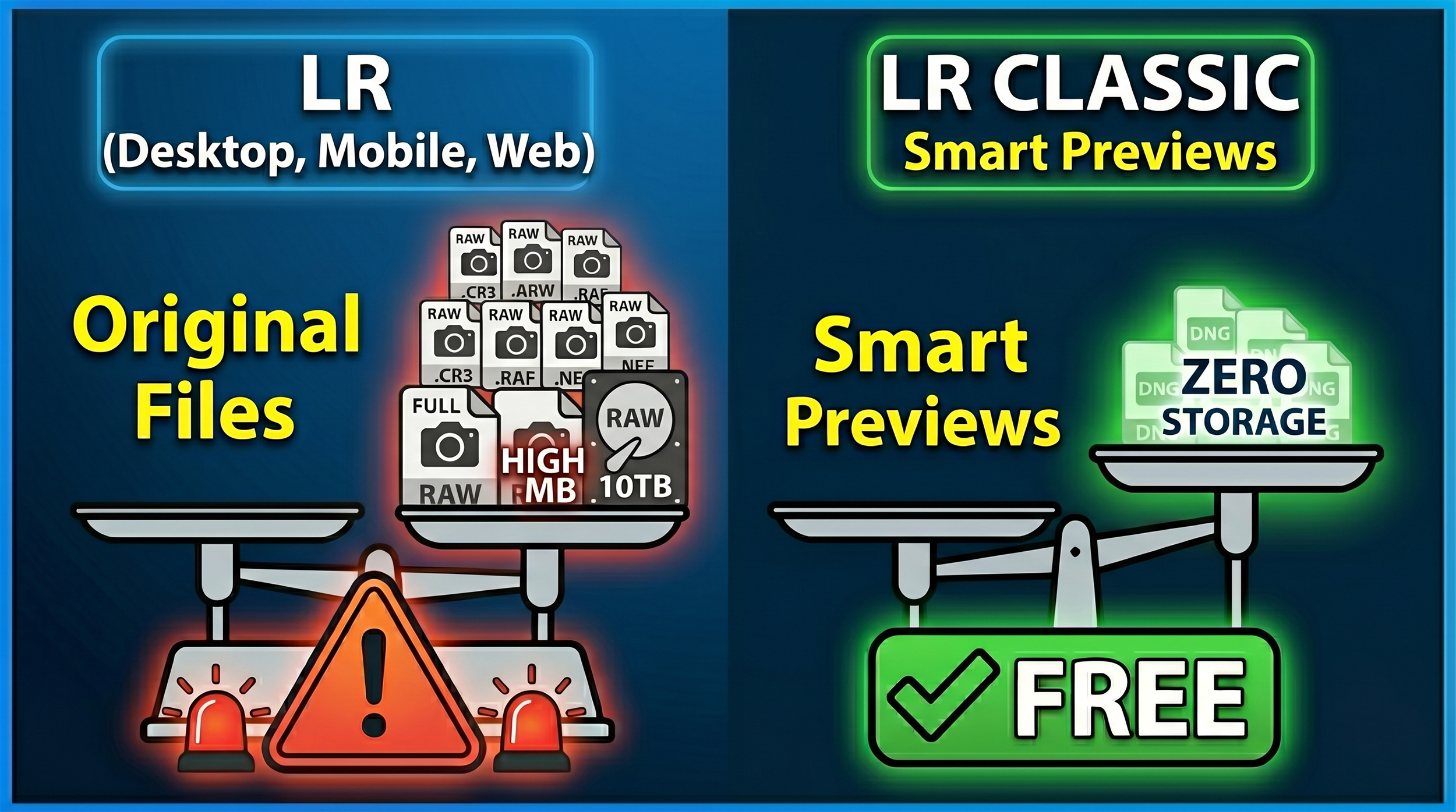
Graphic comparing original files in Lightroom with smart previews in Lightroom Classic

Uploading from Lightroom Desktop or Mobile

When you copy photos to the cloud using Lightroom Desktop or Mobile, you're uploading the original file, whether that's a RAW or a JPEG.

  • Cloud storage: This counts against your Adobe storage allowance. Every file you add uses the same amount of space as the original. Upload 100 RAW files at 25MB each and you've used 2.5GB of your plan's storage, whether that's 20GB or 1TB.

  • What your “client” downloads: A full-resolution JPEG. The pixel dimensions match your original, so a 24-megapixel file stays 24 megapixels. Adobe converts the RAW to JPEG for delivery, so a 24MB RAW might come down as a 4 to 8MB JPEG, but the detail is all there.

Official Adobe Reference: You can read the storage rules directly in the Adobe Help: Lightroom Cloud Storage FAQ. Look under the "How does storage work in Lightroom?" section, which details how original files consume your plan's space.

Syncing from Lightroom Classic

When you tick the Sync with Lightroom box on a Collection inside Classic, your original files stay on your hard drive. What goes up to the cloud is a Smart Preview.

  • Cloud storage: This uses none of your allocated storage. Adobe syncs these Smart Previews completely free of charge, and they count for nothing against your 20GB or 1TB limit.

  • What your “client” downloads: A reduced-resolution JPEG, capped at 2560 pixels on the longest edge. That's it. Because the cloud only holds the Smart Preview, that's all anyone can download.

Official Adobe Reference: This storage exception is outlined in the Adobe Help: Sync Lightroom Classic with Lightroom Ecosystem guide. Check the "Sync overview" and the "FAQ" at the bottom, which explicitly states that Smart Previews do not consume your cloud storage quota.

Quick Summary

If you're sharing a web gallery and have Allow Downloads switched on, what your viewer receives depends entirely on where the file came from:

  • Lightroom Desktop or Mobile as the source: Uses your cloud storage. Viewer downloads a full-resolution JPEG.

  • Lightroom Classic Collection as the source: Uses zero cloud storage. Viewer downloads a 2560px JPEG, maximum.

Official Adobe Reference: The download behavior for shared galleries is documented in the Adobe Help: Share Photos and Albums from Lightroom Web guide under the "Allow downloads" and "Shared Album Settings" toggles.

The practical takeaway is straightforward; if your “clients” need full-resolution files, upload via Lightroom Desktop or Mobile and keep an eye on your storage. If they just need to view images or grab web-sized copies, syncing from Classic is far more efficient and won't touch your storage allowance at all.